funnelkit
Redesigned my account & landing
pages, Increased 22% conversions and user engagement
FunnelKit stands out by offering robust solutions designed to maximize sales and streamline operations for businesses using WordPress. Our persona combines Small and medium business (mainly ecommerce)
In this project, we revamped the user experience and redesigned the My Account and Checkout feature landing page in timeline of 1 month
As the Sole Product Designer for both the Checkout landing page and many other and "My Account" redesigns, I led the end-to-end design process.
My responsibilities spanned analyzing user pain points and business needs, mapping user flows, improving information architecture, high-fidelity visual designs for both areas, collaborating with development for implementation, and analyzing the post-launch impact.
Checkout landing page
Outdated Design: The page hadn't been redesigned in approximately four years, resulting in dated visual appeal and structural clarity compared to modern standards.
Poor User Engagement: Analysis revealed low average engagement time (~34 secs) and a notable bounce rate (~18.7%), suggesting users struggled to find information quickly or engage deeply with the content.
Ineffective Value Communication: The outdated design failed to effectively communicate the full value and breadth of Aero's features.
Missed Conversion Opportunity: These factors hindered the page's ability to convert visitors effectively. clear opportunity to boost engagement, potentially improve traffic through better performance metrics.
My account
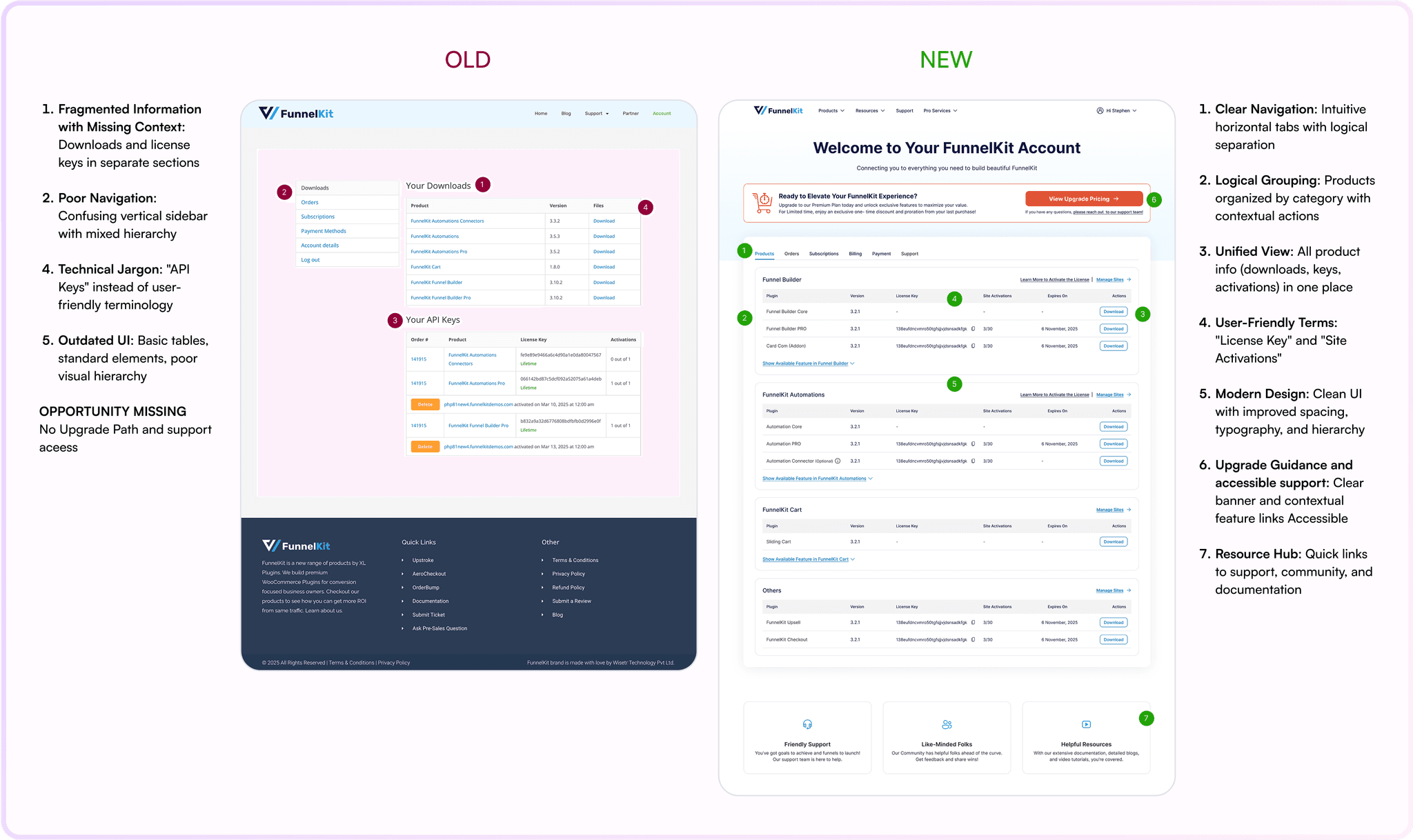
Lack of Clarity: Users struggled to understand which specific plugins and features were included in their purchased plan.
Information Fragmentation lead heavy support tickets: Critical information like plugin downloads, license keys, and activation status was scattered across different sections (Downloads, API Keys, Subscriptions), requiring users to piece things together.
Activation Friction: The process of finding the correct download, matching it with the right license key, and managing activations was unintuitive and cumbersomer.
Poor Support Access: Finding relevant help documentation or contacting support wasn't straightforward, especially when encountering issues within specific sections.
Goals
Business Goals:
Checkout: Increase conversion rates on the checkout page, reduce cart abandonment, improve user engagement on the feature page, and enhance SERP ranking through better user experience signals.
My Account: Significantly decrease support tickets related to account access, downloads, and license activation; increase the rate of successful plugin activations per user; boost user engagement with upgrade prompts and drive upgrade revenue.
Overall: Enhance user satisfaction and retention, improve operational efficiency (reduced support load), and increase customer lifetime value.
User Goals:
Checkout: Experience a seamless, intuitive, fast, and trustworthy checkout process; easily understand the features and benefits of FunnelKit Aero.
My Account: Effortlessly understand included products, licenses, and subscription status; quickly download necessary files; intuitively manage license keys and activations; easily access relevant support when needed.
Overall: Feel confident and empowered throughout their entire interaction with FunnelKit, from purchase to ongoing use.
Impact
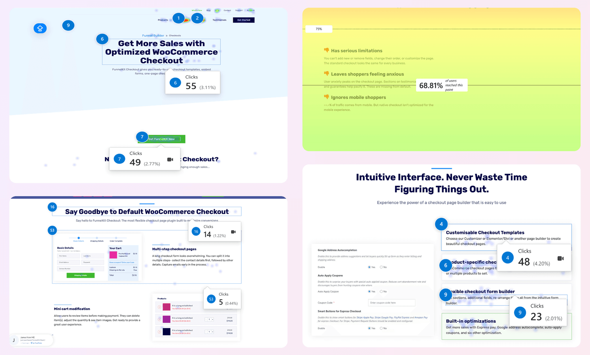
Checkout Feature Landing Page Performance Boost
The revamped Aero checkout landing page demonstrated immediate improvements in user engagement and interaction:
•🚀 +23% Page Views: Within the first 7 days post-launch, indicating improved discoverability.
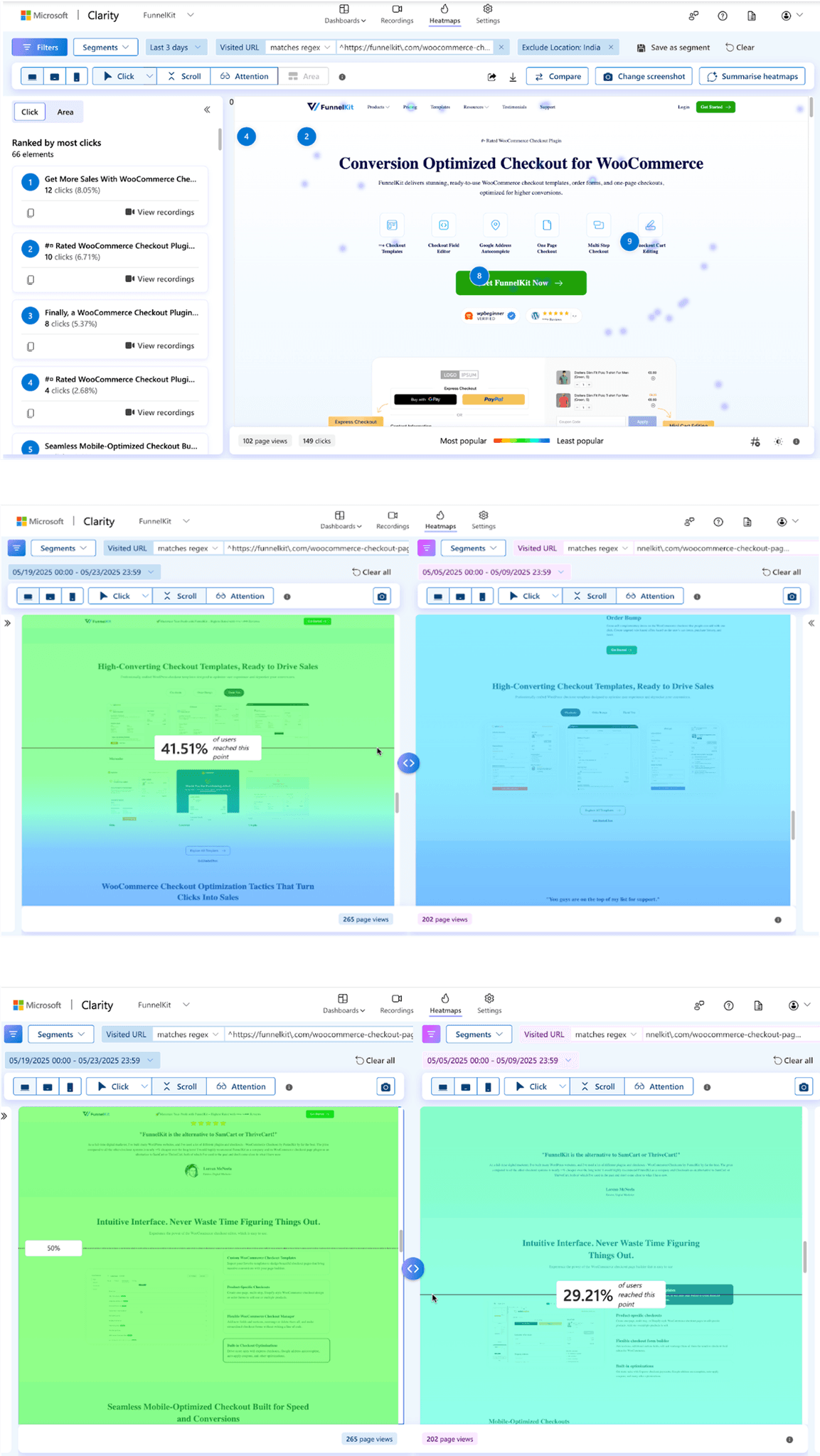
•🎯 Main CTA Rank moving from the 22nd most clicked element to the Top 8, showing higher user intent.
•🖱️ Deeper Exploration: Increased clicks on secondary CTAs and pricing links. and Improved scroll depth (visible in heatmaps) and increased average time on page.
CHECKOUT PAGE
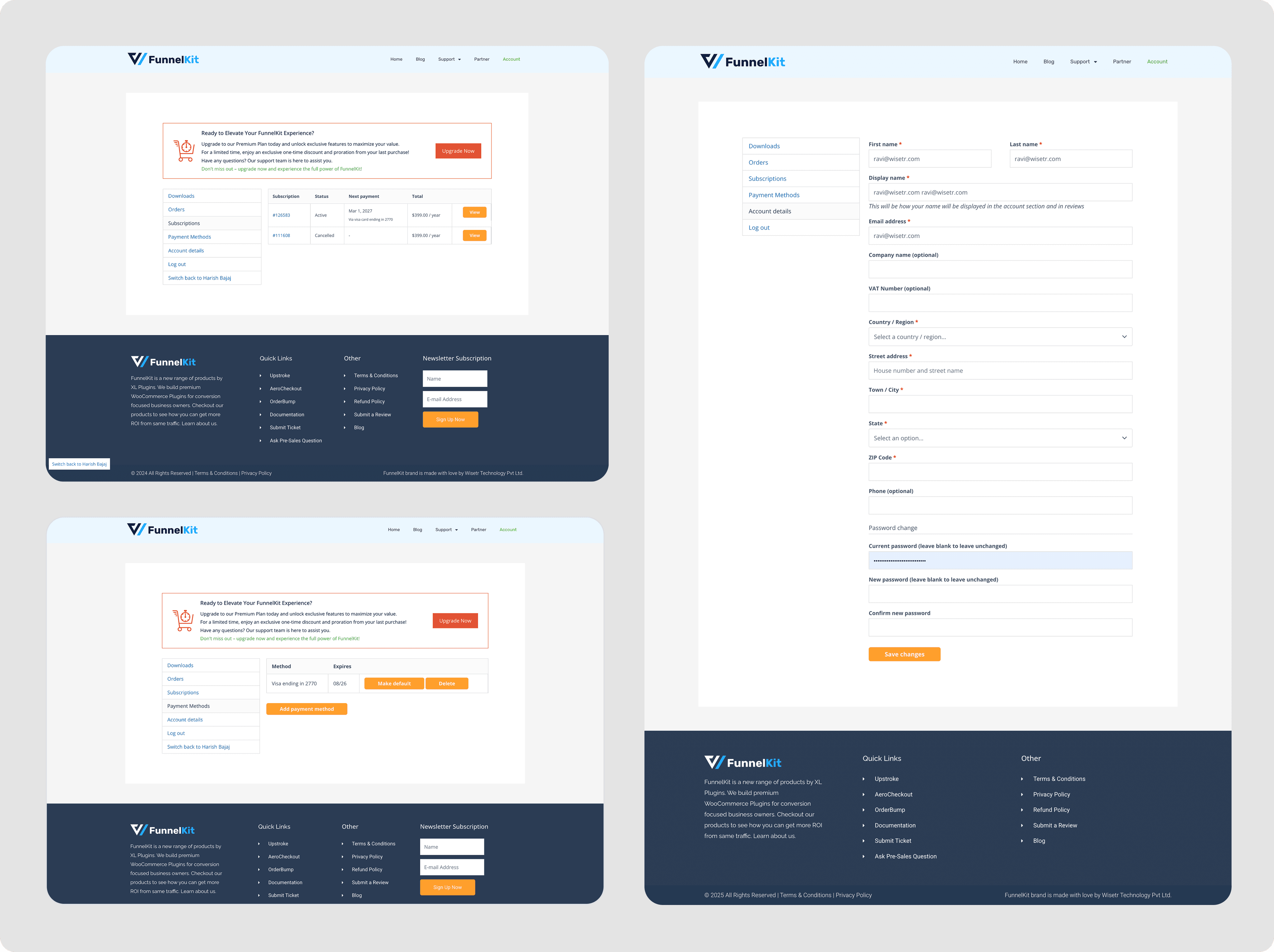
"My Account" Dashboard Efficiency Gains
The redesigned "My Account" area transformed the post-purchase experience, leading to impressive gains in user efficiency and reduced operational load:
•📉 -45% Support Tickets: Support requests related to license activation and finding downloads saw a with in 1.5 month post-launch, freeing up valuable support resources.
•✅ +30% Activation Rate: The streamlined "Products" hub directly contributed to a 30% increase in the rate of users activating their purchased plugins within 72 hours of purchase.
MY ACCOUNT PROTOTYPE
Early research and ideation
Session monitoring Insights
CTA Confusion & Navigation Friction: Users frequently clicked non-interactive elements (like the hero text) instead of the main CTA, while header navigation, though heavily used, potentially led users away due to low engagement time and poor product visibility
Mid-Page Underengagement: Key sections in the middle of the page suffered from very low click rates despite high scroll reach, indicating unengaging content.
Interaction Errors: Some headings were mistakenly perceived as clickable, causing dead clicks.
Missed Conversion Opportunities: Users showed interest in lower-page content but lacked immediate CTAs, forcing them to scroll back up and creating friction.
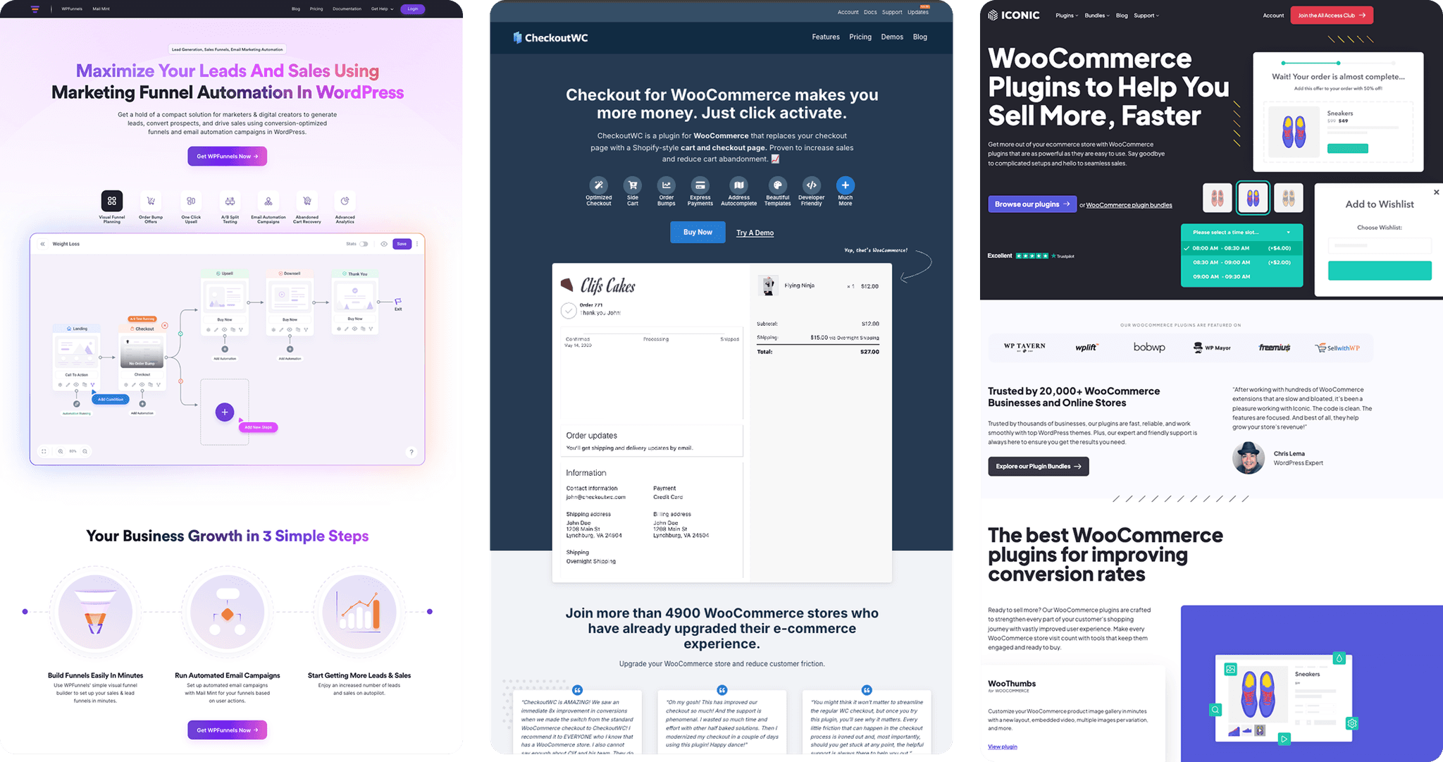
Competitor research Insights
Key competitors like CartFlows, ThriveCart, SamCart, etc. Key points would include:* *
Feature Presentation Gap: Competitors used interactive demos and videos while FunnelKit relied on static text descriptions.
Social Proof Utilization: Competitors displayed testimonials, case studies, and metrics throughout pages; FunnelKit's implementation was limited.
Template Visualization: Competitors showcased templates with interactive galleries and filtering options; FunnelKit lacked visual exploration tools.
Integration Ecosystem: Competitors highlighted integrations with partner logos and use-case scenarios; FunnelKit's integration presentation was less effective.
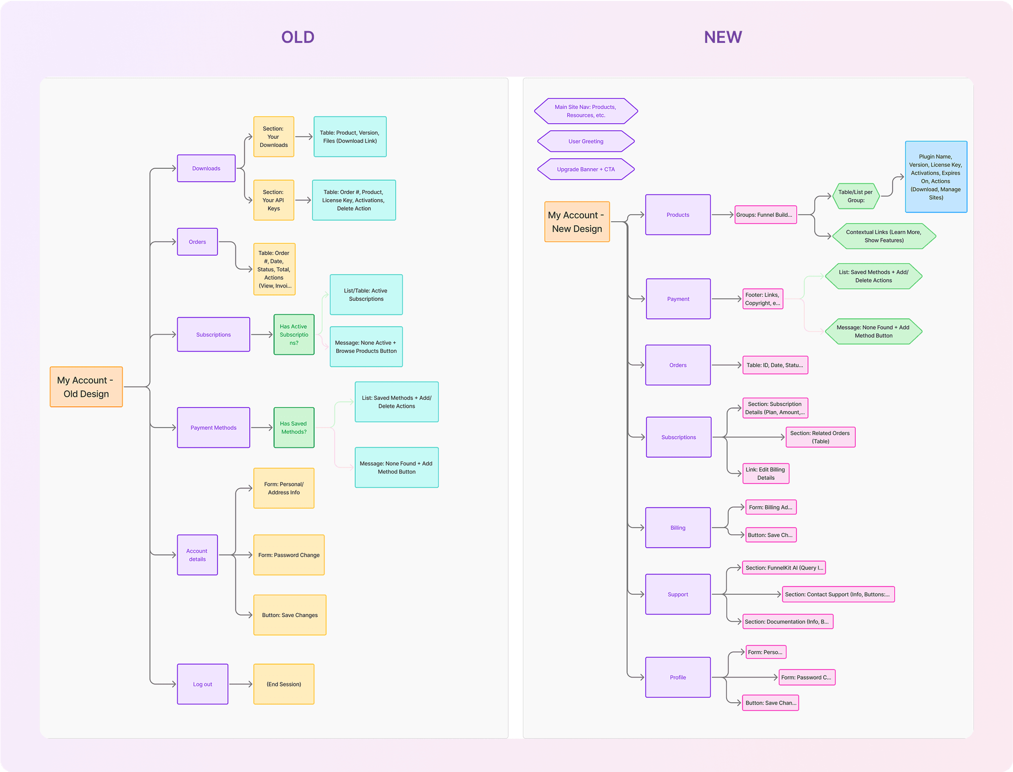
Information Architecture of My Account
The "My Account" area problems were fundamentally information architecture (IA) issues rather than just visual design challenges, making IA redesign the most effective solution for several key reasons:
Root Cause Analysis: Our research revealed that user confusion stemmed primarily from how information was structured and connected, not just how it looked. Users couldn't mentally map the relationship between downloads, license keys, and activations because these elements existed in separate, disconnected sections.
Mental Model Alignment: The previous structure forced users to create their own mental connections between fragmented pieces of information. By reorganizing content around product categories (Builder, Automations, Cart) rather than information types (Downloads, API Keys), we aligned the interface with how users naturally think about their purchases.
Contextual Decision Making: Users needed to make decisions with complete context. For example, deciding whether to activate a plugin on a new site required knowing both how many activations remained and which sites were already using the license.
These are early iterations we did around 6-7 iterations of each before the final outcome.

Product Screen:
Products are now logically grouped by category (Builder, Automations, Cart, etc.), creating a clear mental model for users to understand the FunnelKit ecosystem. Each product entry combines essential information (version, license key, site activations, expiry) in a single row, eliminating the need to navigate between separate sections.
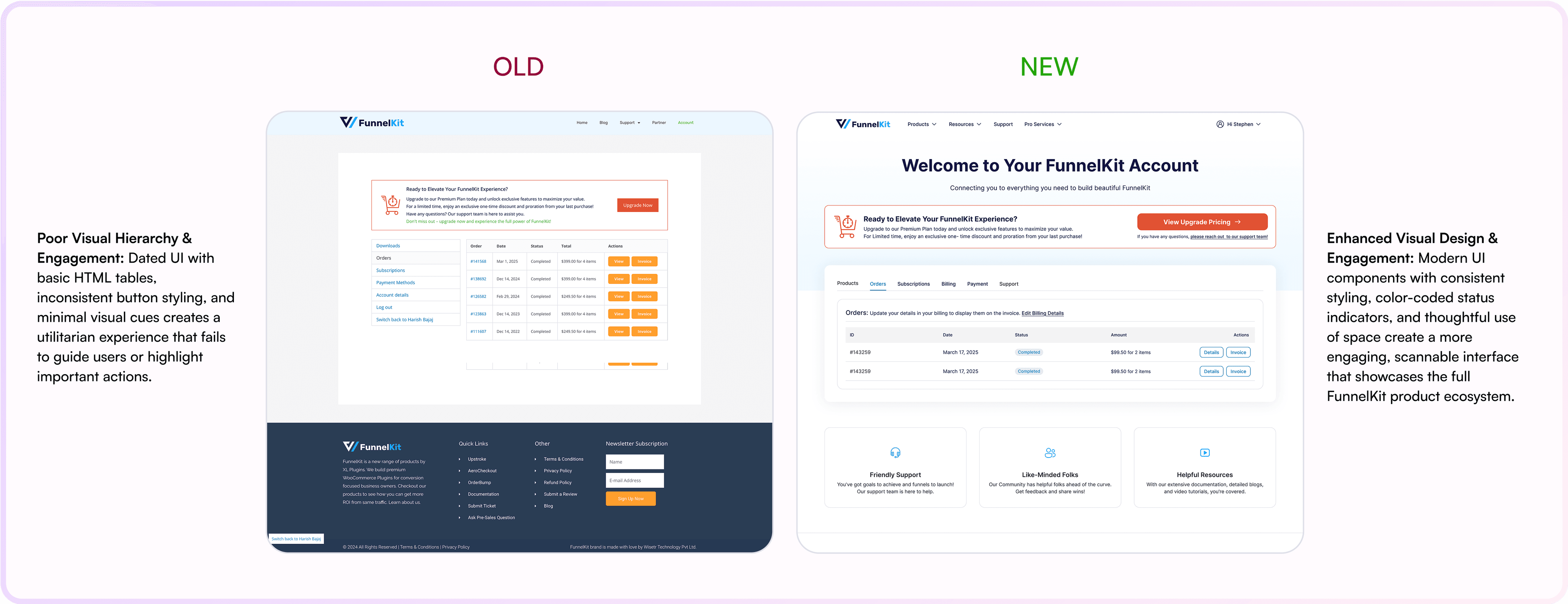
Order Screen:
Its contextual header with actionable links, clean table layout with logical information hierarchy, color-coded status indicators for quick scanning, consistently styled dual action buttons for clear task paths, simplified pricing display for improved scanability, and integrated tab navigation that maintains context while moving between related account sections.
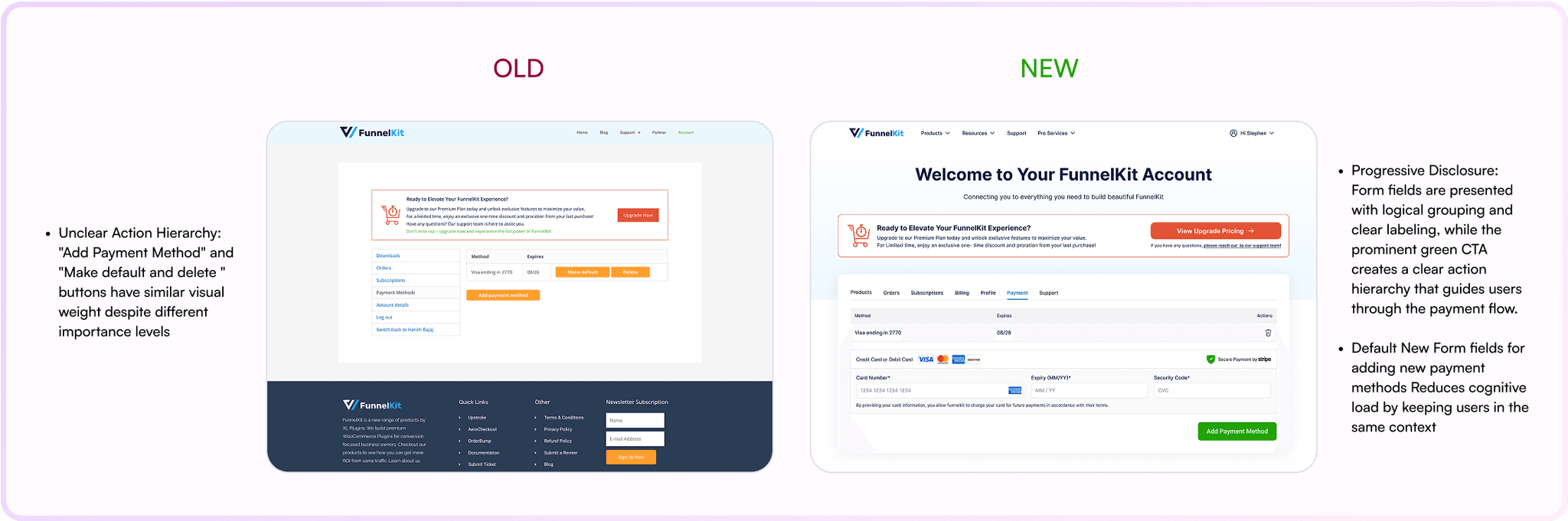
Payment Screen:
The redesigned Orders screen delivers a superior user experience through its contextual header with actionable links, clean table layout with logical information hierarchy, color-coded status indicators for quick scanning, consistently styled dual action buttons for clear task paths, simplified pricing display for improved scanability, and integrated tab navigation that maintains context while moving between related account sections.
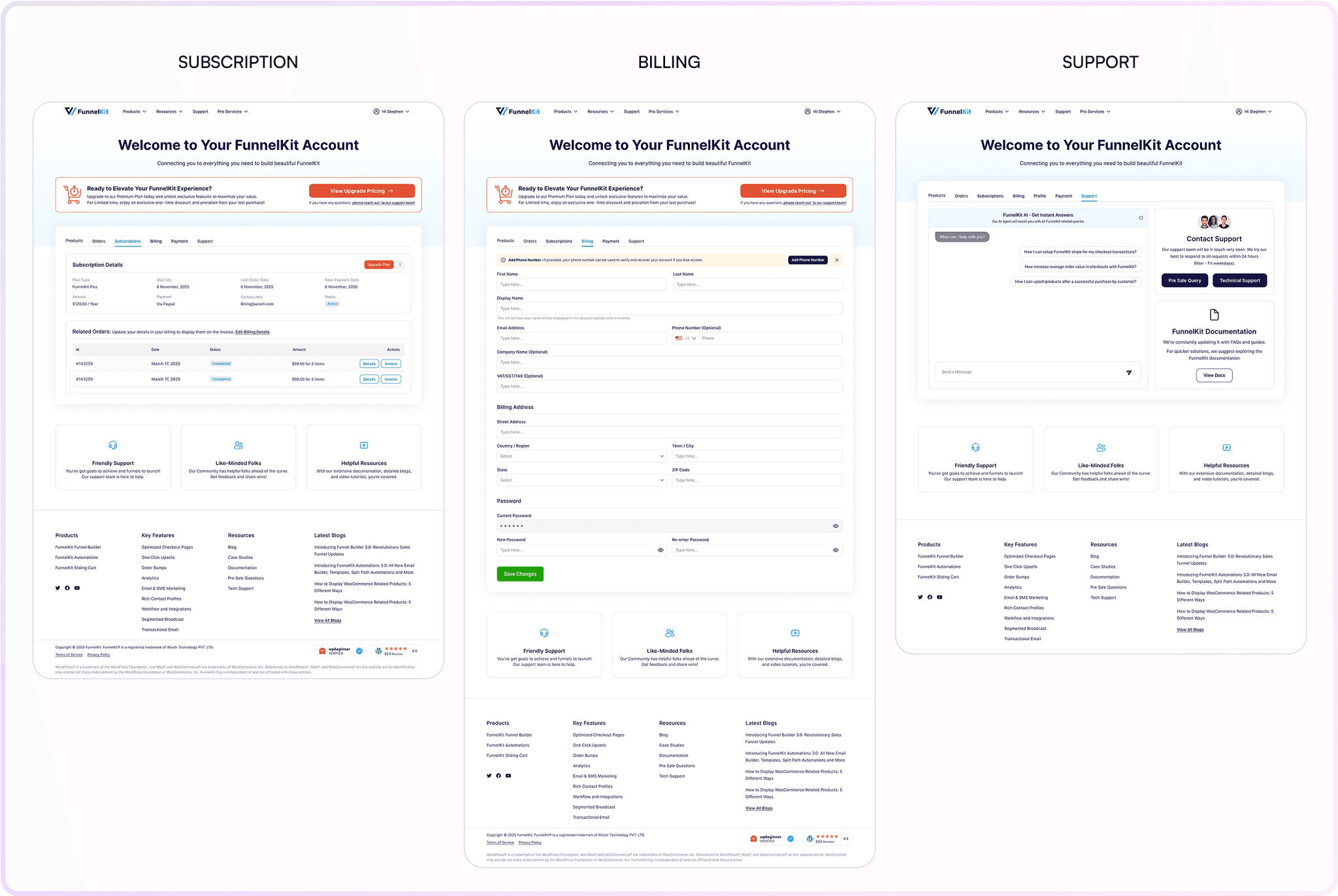
Other Screens
Checkout Feature Landing Page
Redesigned focused on the increasing engagement and dicoverability of the features we are offering our customers to increase their sales and engagement visually with introducing GIF in explaining features, template visibility on the feature page.
CHECKOUT PAGE
AFTER LAUNCH RESULT TRACKING
Analytics Integration: Adding usage analytics directly into the product sections could help users understand how their implementations are performing and identify optimization opportunities.
Guided Onboarding: Building on the improved information architecture, a guided onboarding flow could further reduce activation friction by walking new users through their first download, license activation, and implementation.
Cross-Product Integration Visualization: Creating visual representations of how different FunnelKit products work together could encourage users to explore and adopt complementary tools within the ecosystem.
LEARNINGS