
The email that only sends when there’s something new
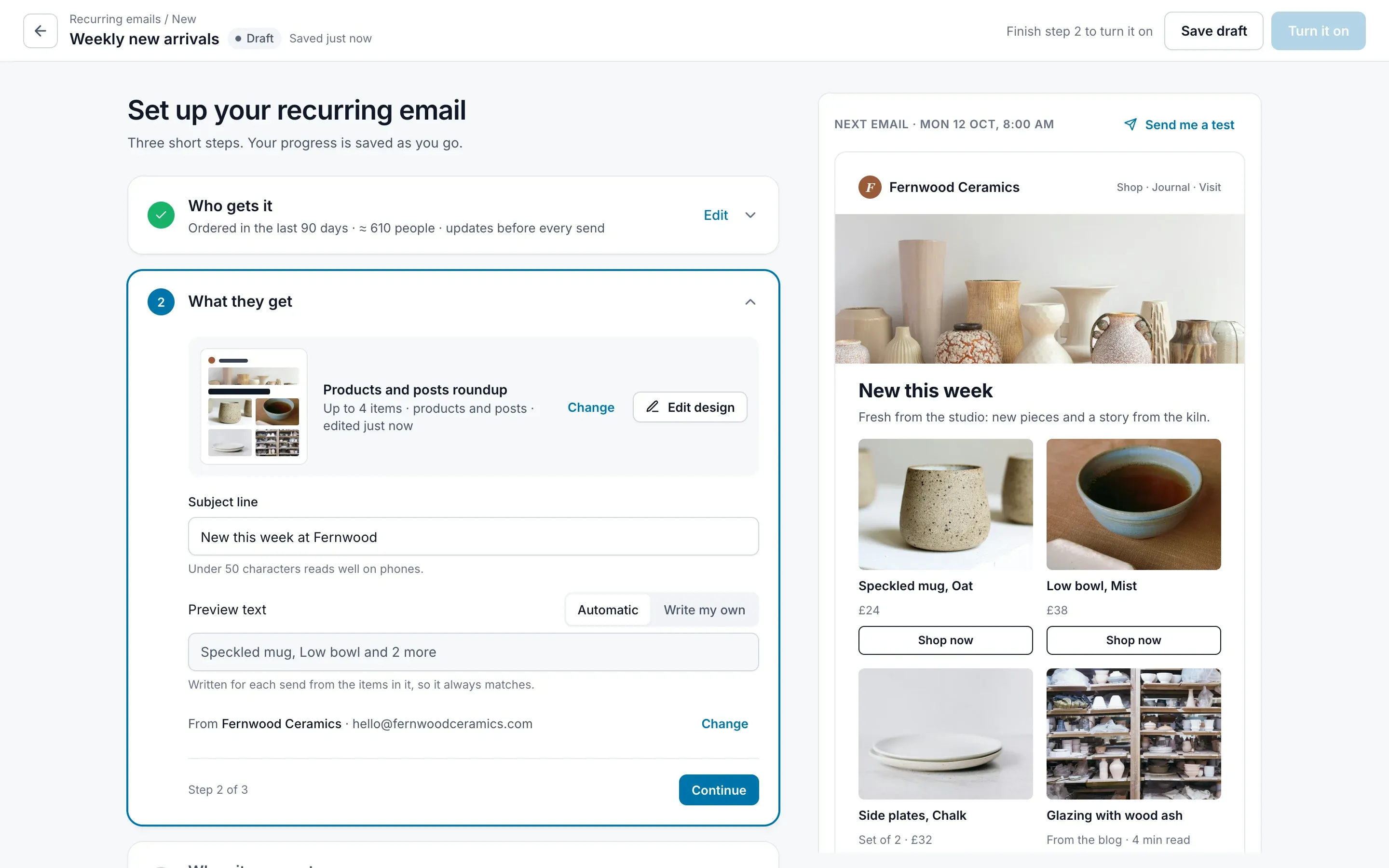
A screen-by-screen critique of the 2022 recurring emails design at FunnelKit, and my redesign that answers each moment.
- Company
- FunnelKit
- Role
- Product Designer
- Original design
- 2022, by another designer
- At FunnelKit
- Until 2025
Why this mattered
Store owners kept asking for the same thing
Send my newest products and posts to my subscribers every week, without building a new email each time.
Over six months, about 150 requests reached support.
The workaround? Support switched scheduling on by hand, store by store.
The 2022 design could do the job. But it asked a lot of the people it was built for.
Recurring emails were first designed in 2022, by another designer. This case study is my redesign of that flow.
It goes through the 2022 screens one moment at a time, asks what each one asked of the store owner, then shows how the redesign answers it.
A recurring email is a promise: every one of them has something new in it.
That sentence became the test for every screen. There are three ways to break it:
- Sending an empty emailNothing new was published, and the email goes out anyway.
- Repeating last weekThe same products show up two sends in a row.
- Calling a restock “new”An old product comes back in stock and is presented as new.
The 2022 design could keep the promise, but it hid how. The redesign makes it visible.
Who it’s for
Two people shaped the decisions
Both are composites, built from conversations with customers and the support team.
Meera
Runs a small ceramics store. Her first recurring email.
Wants new pieces and posts to go out on their own, so she can stay in the studio.
Worries about sending something empty or wrong to customers who trust her.
Daniel
A marketer running emails for several stores.
Wants control: segments, exclusions, resends, and a clear reason when something goes wrong.
Worries about automation he can’t check or explain to a client.
Walkthrough 1
The 2022 design, moment by moment
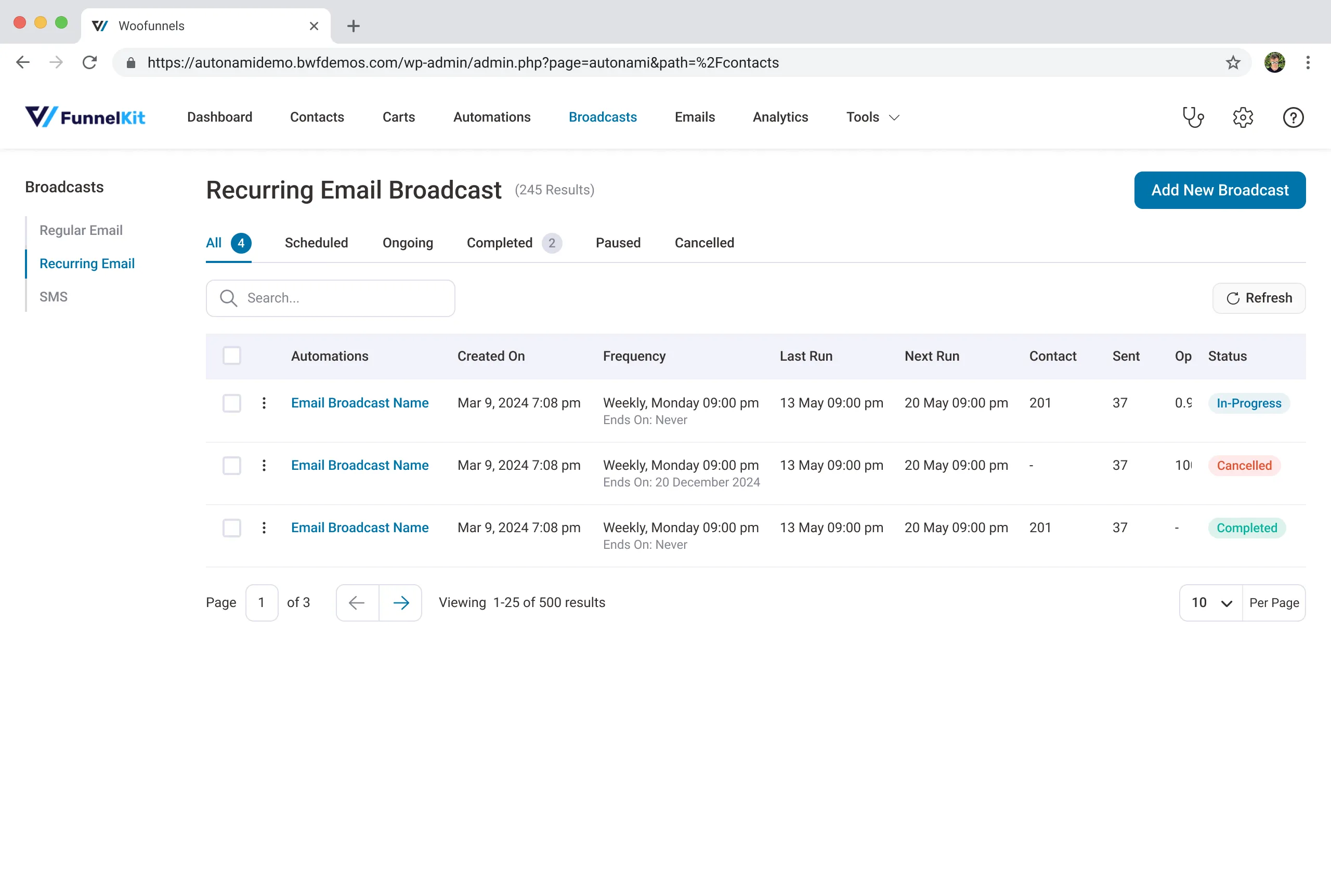
This is where I started: a list of recurring broadcasts and a five-step wizard, designed in 2022.
Step through it the way Meera would meet it. Each moment is lit up on the screen, with what she’s likely thinking beside it.
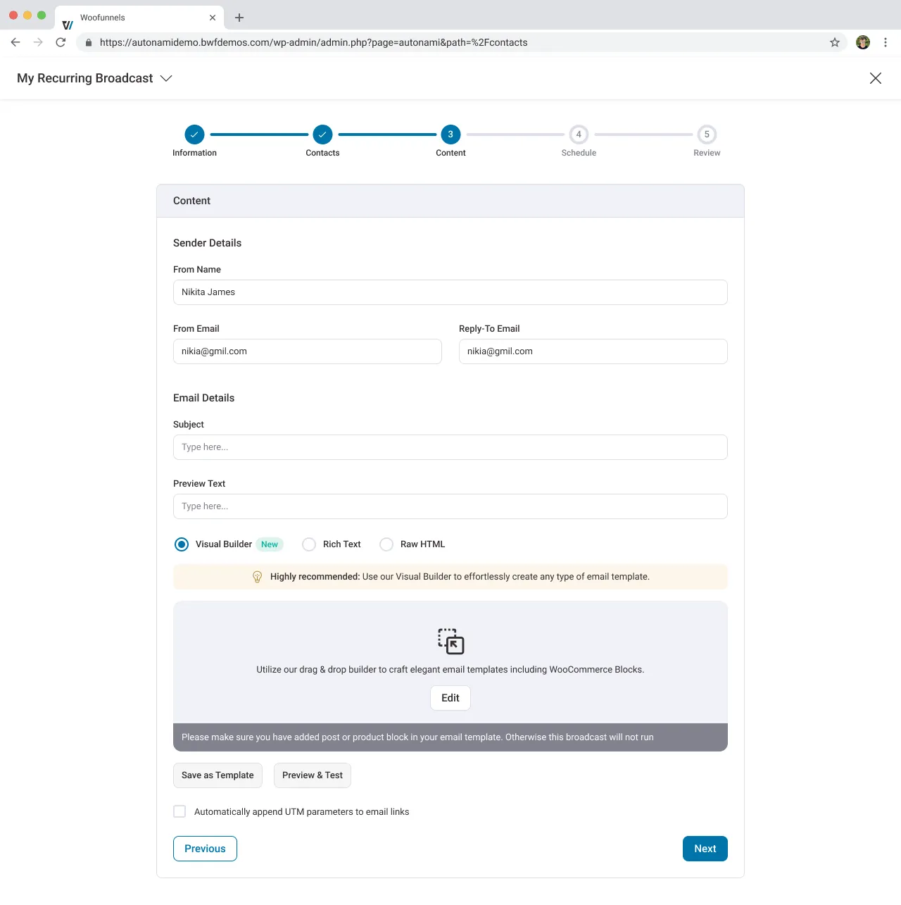
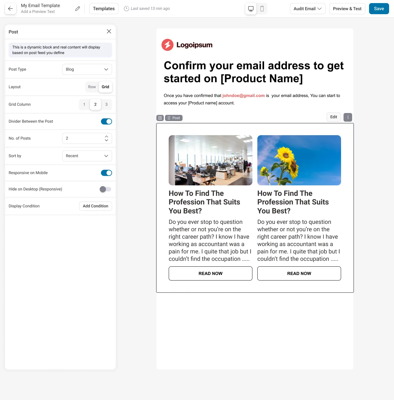
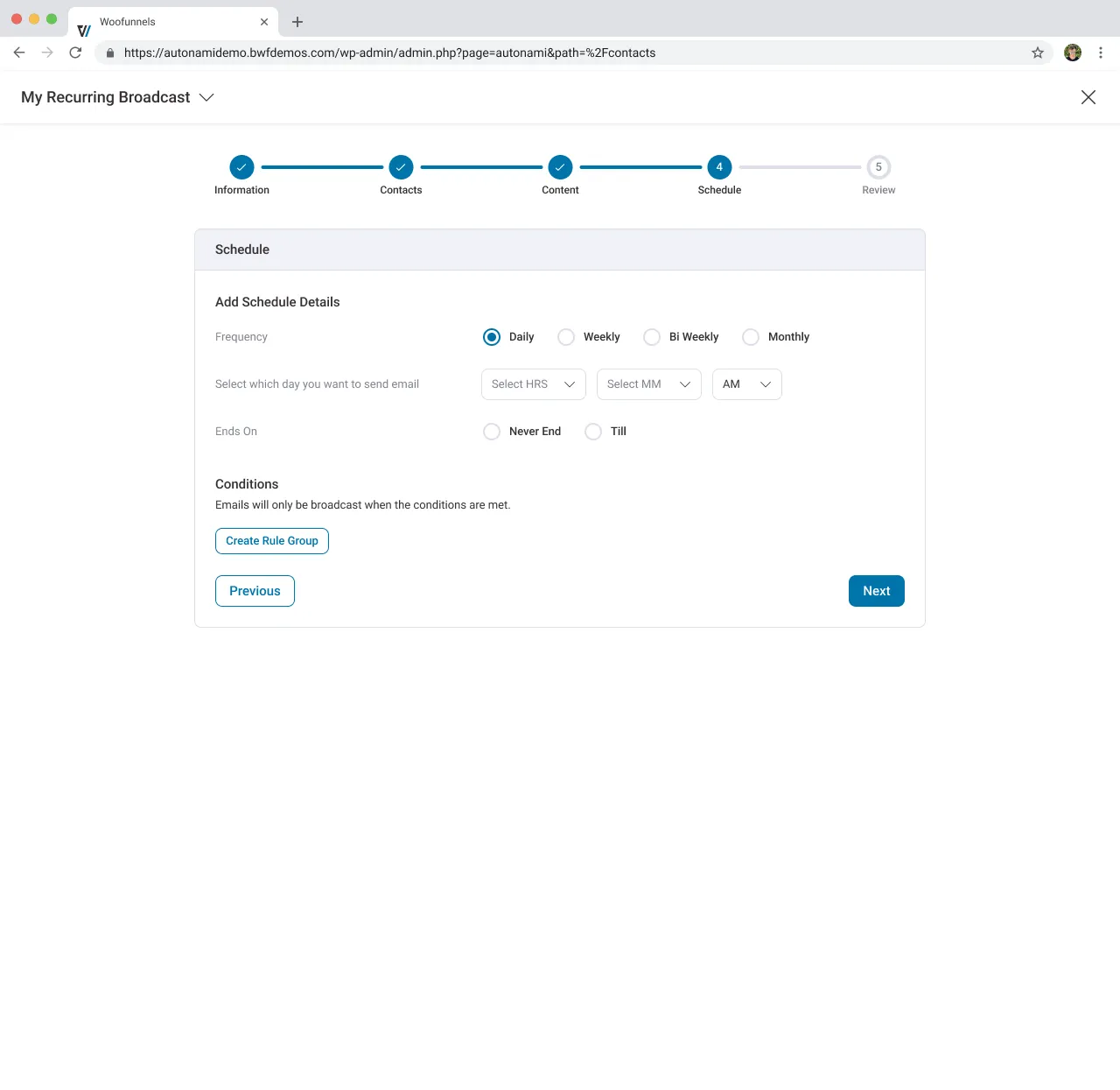
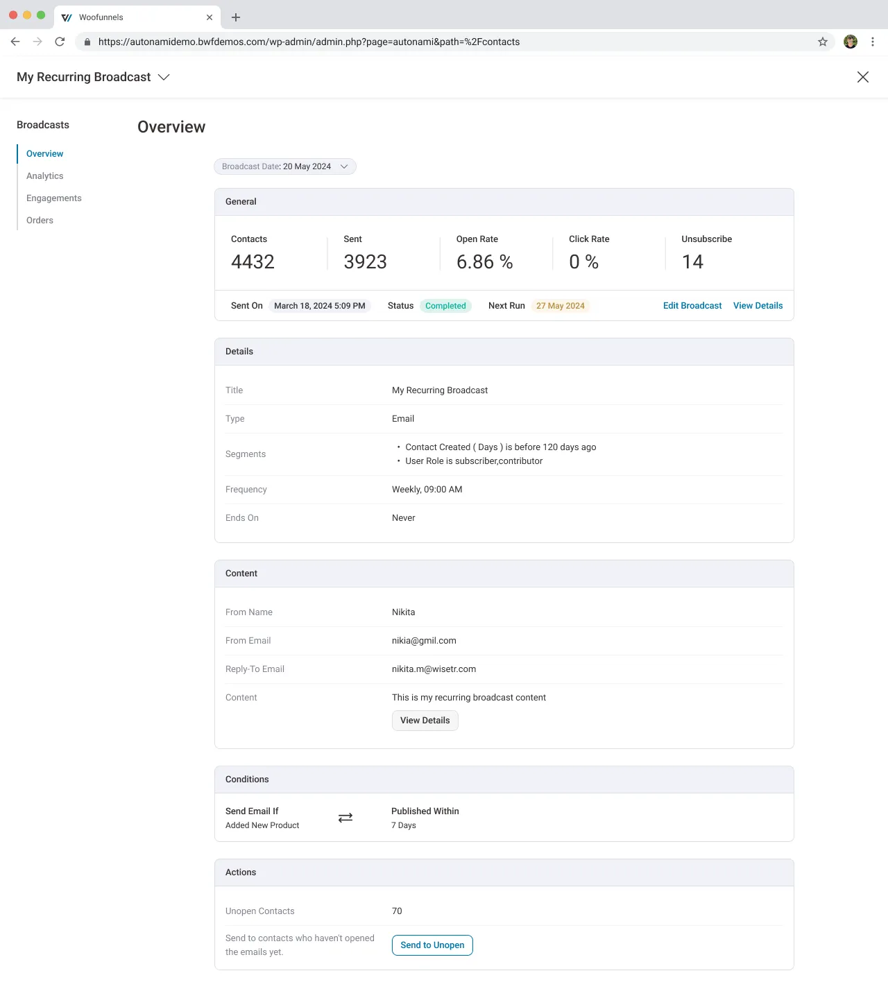
01 / 14 · Recurring broadcasts list
Five tabs for something that is either running or not.
“Is ‘Ongoing’ different from ‘Scheduled’? Which one is mine?”
Mental model mismatch
02 / 14 · Recurring broadcasts list
‘Next run’ says when, never what. Nothing tells the owner whether Monday’s email has anything in it.
“I’ll have to open each one to check.”
Hidden system status
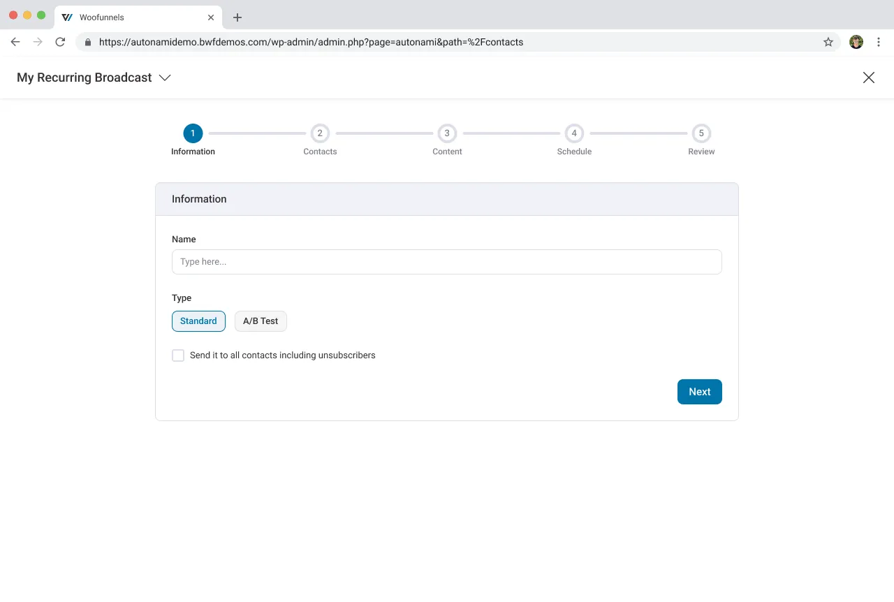
03 / 14 · Step 1 of 5 · Information
Five steps stand between the owner and a first email.
“Five? I only wanted my new pieces to go out.”
Perceived effort
04 / 14 · Step 1 of 5 · Information
The first decision is about A/B testing, asked before there is anything to test.
“Standard, I guess? I don’t know what I’m choosing.”
Choice without context
05 / 14 · Step 1 of 5 · Information
One tick sends it to people who unsubscribed: a legal and reputation risk, one click away.
Error prevention
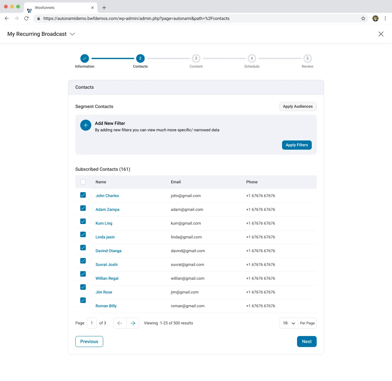
06 / 14 · Step 2 of 5 · Contacts
Two ‘Apply’ buttons, for two different things.
“Do I need both? Which one do I press first?”
Ambiguous labels
07 / 14 · Step 2 of 5 · Contacts
‘Subscribed Contacts (161)’ above, ‘1–25 of 500 results’ below. And every row is ticked by hand.
“Is everyone in? What about page 2?”
Consistency
08 / 14 · Step 3 of 5 · Content
Visual Builder, Rich Text or Raw HTML: an engineering choice, asked of a store owner.
Speak the user’s language
09 / 14 · Step 3 of 5 · Content
The one rule that decides whether this email ever sends, in grey fine print.
“I didn’t even see that.”
Salience
10 / 14 · Email builder · Post block
The builder fills the block with the same placeholder post twice. Nothing shows what Monday’s send will carry.
“So what will my customers actually get?”
Uncertainty
11 / 14 · Step 4 of 5 · Schedule
The label asks for a day. The controls ask for a time.
Label and control mismatch
12 / 14 · Step 4 of 5 · Schedule
‘Don’t send when nothing’s new’ exists, but as an empty rule builder.
“What rule would I even write?”
Mental model mismatch
13 / 14 · Overview
‘Completed’, next to ‘Next Run 27 May’. Has it stopped or not?
Contradictory status
14 / 14 · Overview
The email itself is one line of text and a ‘View Details’ button. The skip rule reads like code.
“What did my customers actually receive?”
Show, don’t summarise
The redesign keeps the builder owners already know, and rebuilds everything around it.
Walkthrough 2
My redesign, moment by moment
Each moment answers one from the 2022 design.
- One setup pageThree short steps instead of a five-step wizard.
- The real next emailThe builder shows this week’s actual products, not placeholders.
- An honest overviewEvery send is sent, skipped or late, and says why.
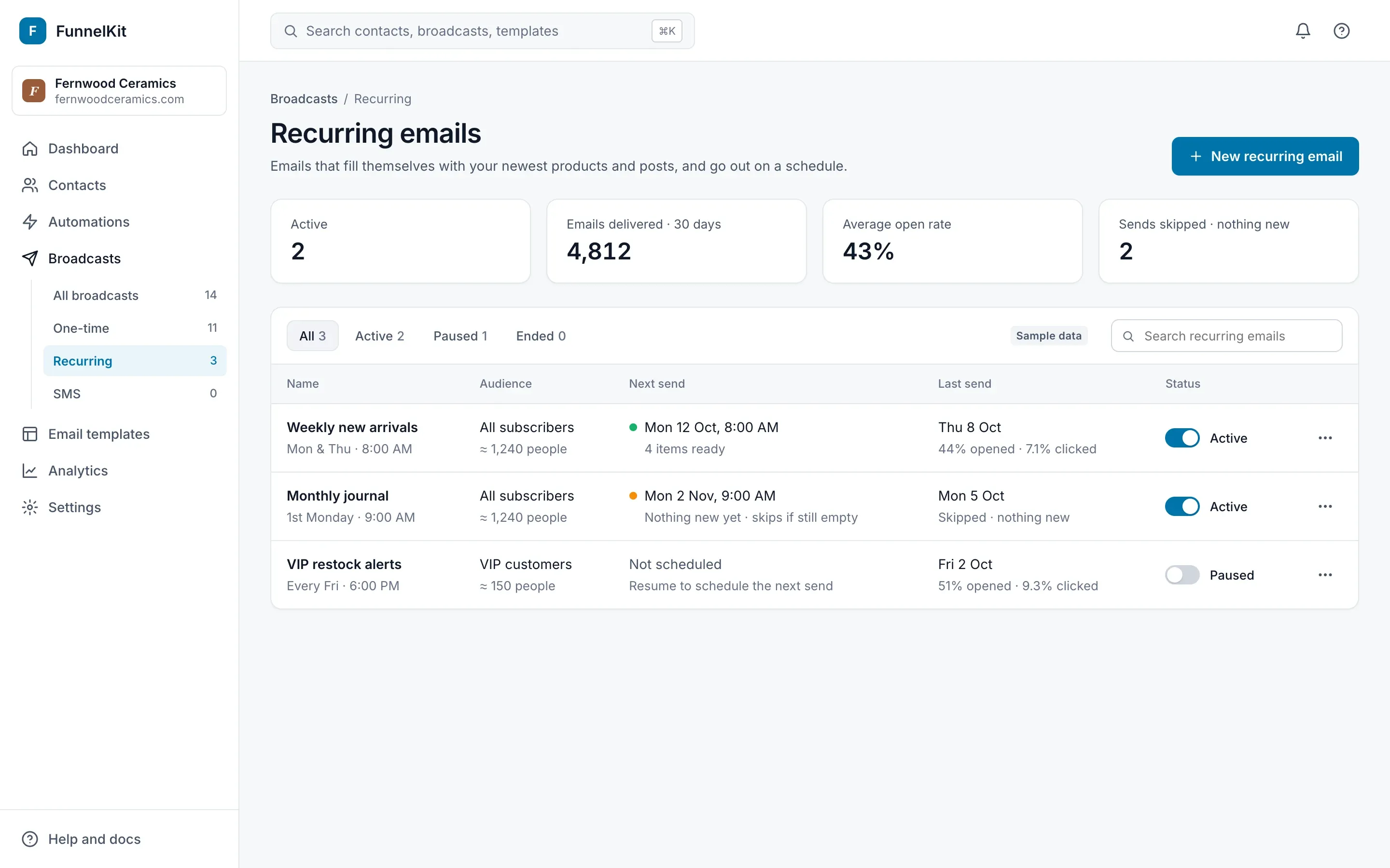
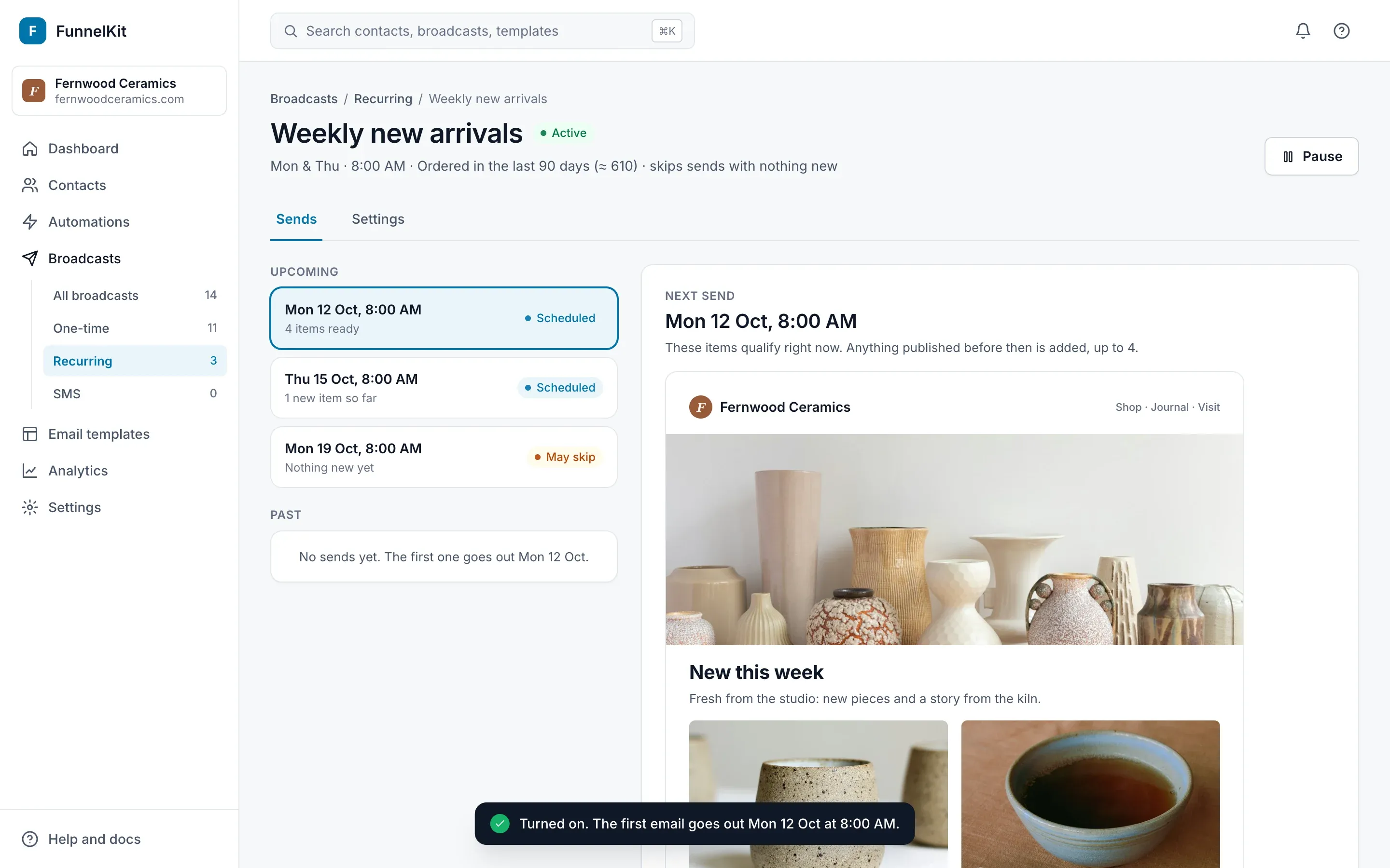
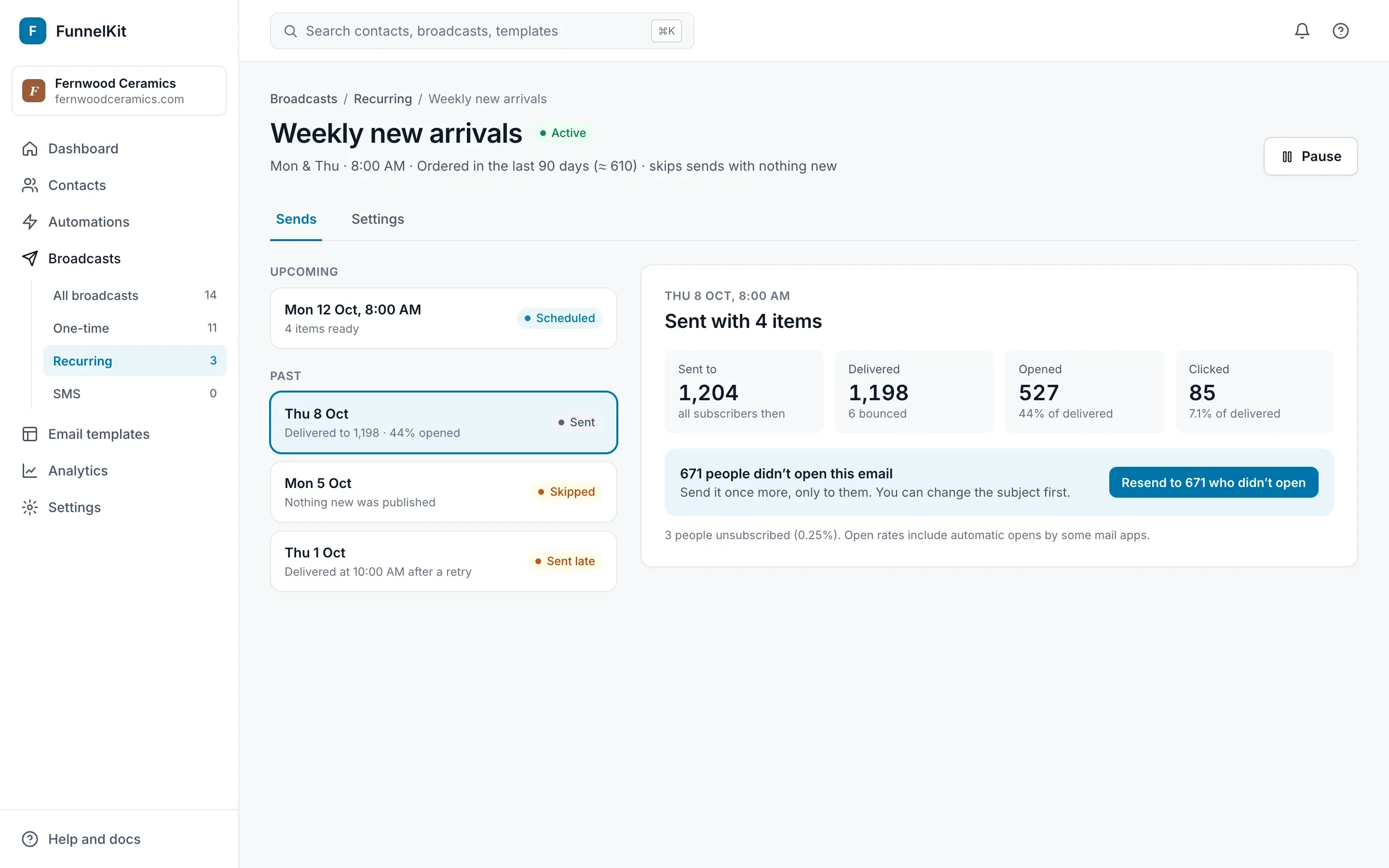
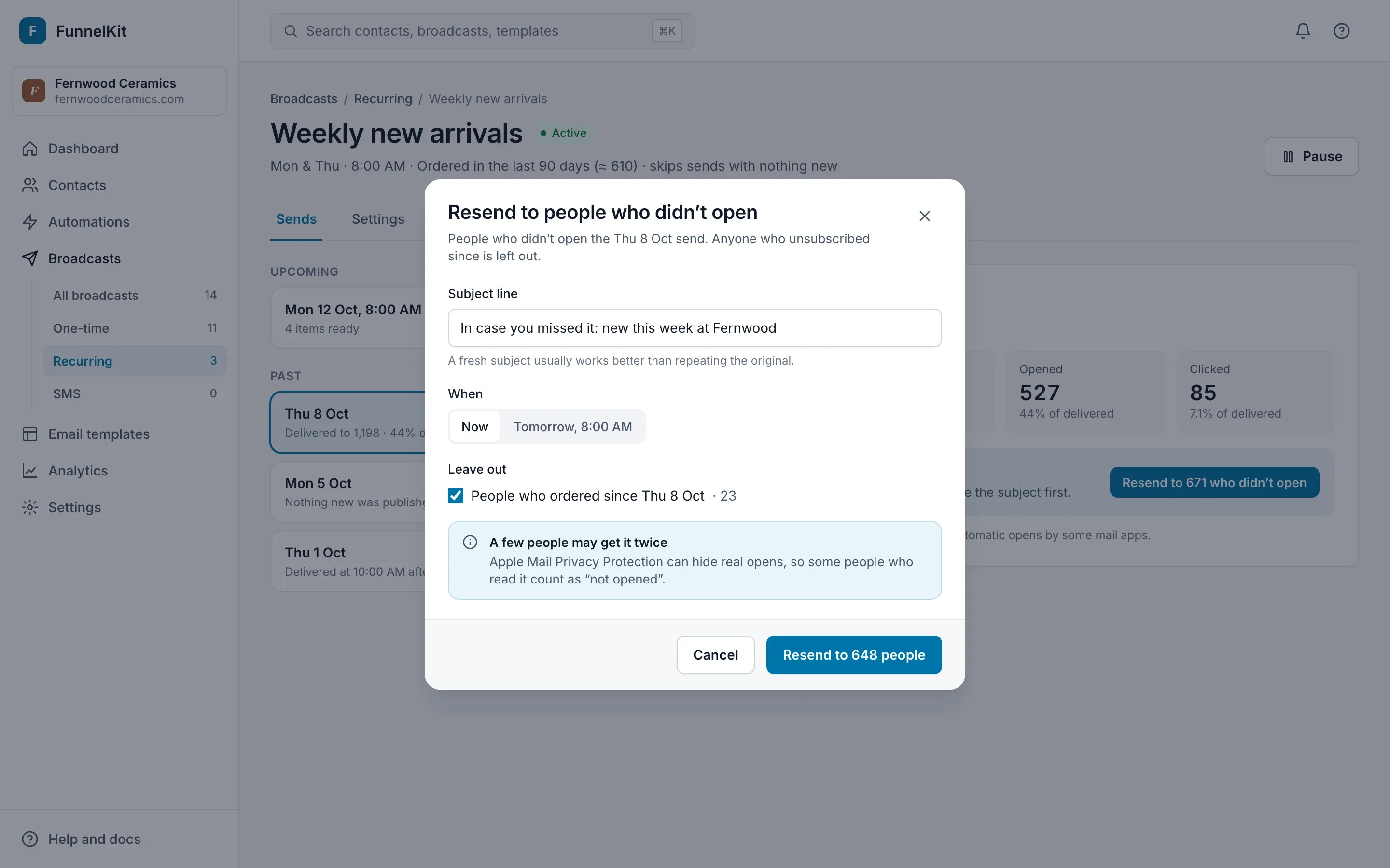
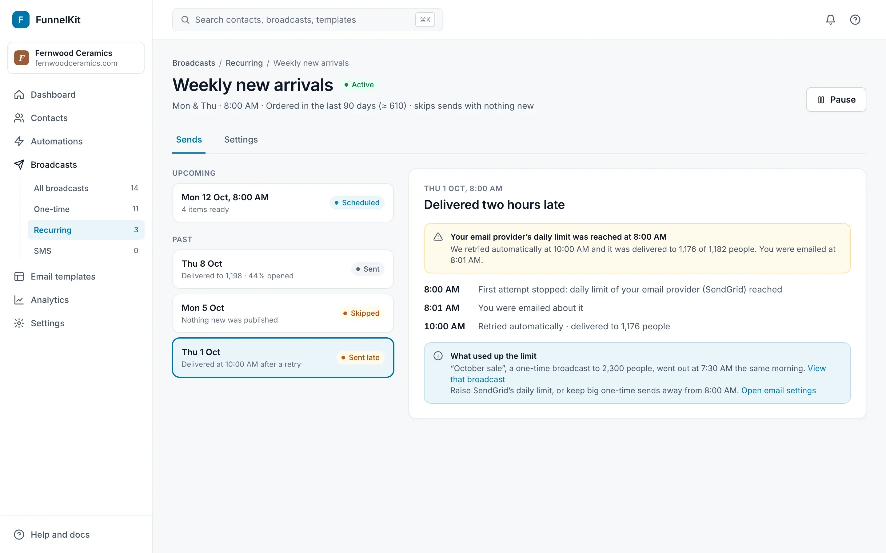
01 / 26 · Recurring emails list
The next send says what is in it, not only when: “4 items ready”, or “Nothing new yet · skips if still empty”.
“So Monday’s email won’t be empty. Good.”
Visibility of system status
02 / 26 · Recurring emails list
Two states, Active or Paused, set with a switch that is labelled in words. The five tabs became one control.
Match the mental model
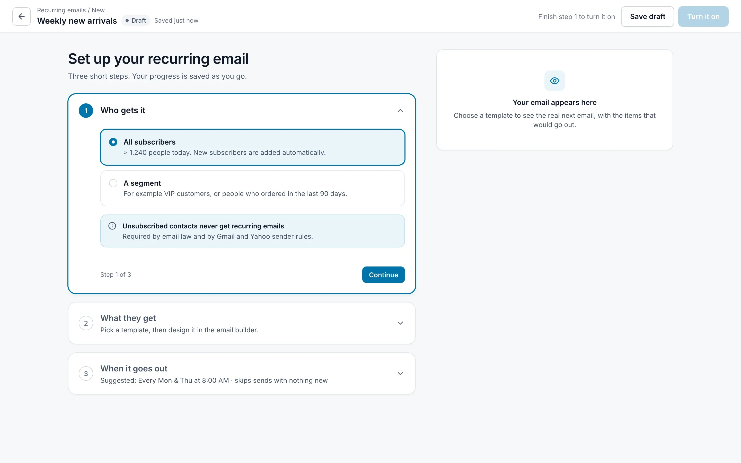
03 / 26 · Setup · Step 1 of 3
The first question is one an owner can answer instantly: who gets it. ‘All subscribers’ is preselected and says what it means.
“That’s what I’d have picked anyway.”
Default effect
04 / 26 · Setup · Step 1 of 3
Everything else waits. One step is open at a time, and each one ends in Continue.
Progressive disclosure
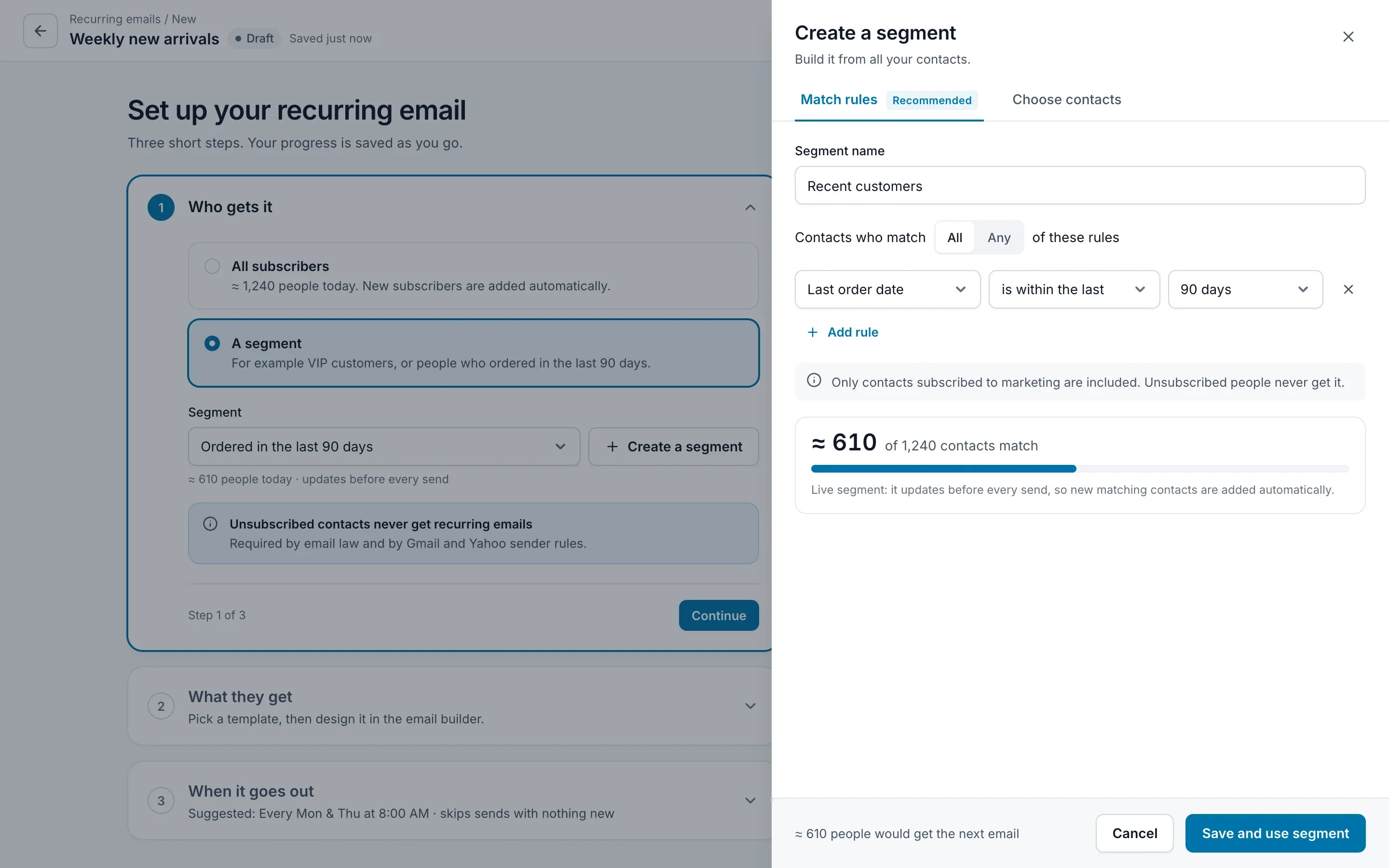
05 / 26 · Step 1 · Create a segment
A segment is a sentence: ‘Last order date is within the last 90 days’.
Speak the user’s language
06 / 26 · Step 1 · Create a segment
Every change updates a live count before anything is saved.
“About half my list. Makes sense.”
Immediate feedback
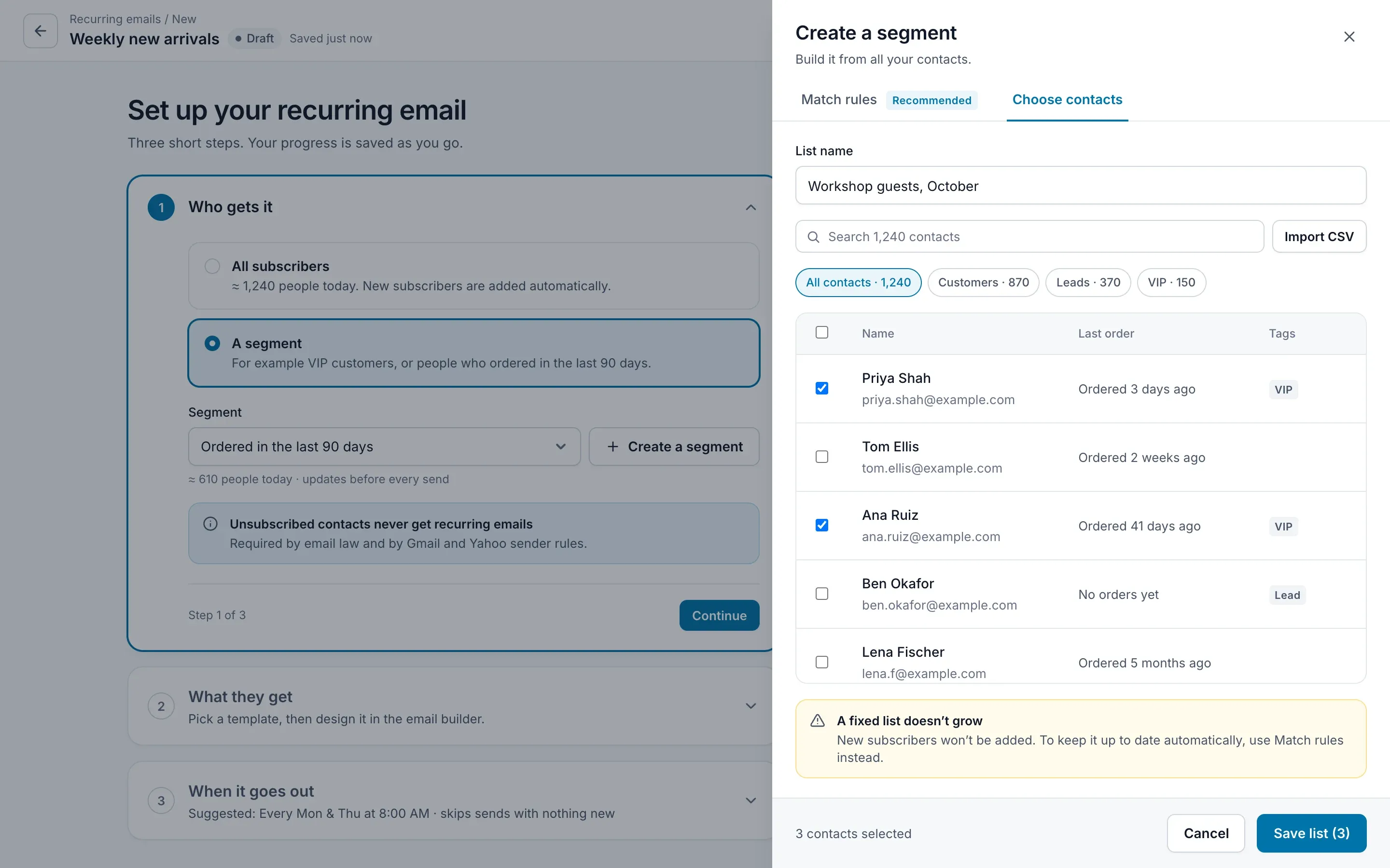
07 / 26 · Step 1 · Choose contacts
Hand-picking contacts is allowed, but the panel says what it costs: a fixed list never grows.
Loss aversion, used to prevent a mistake
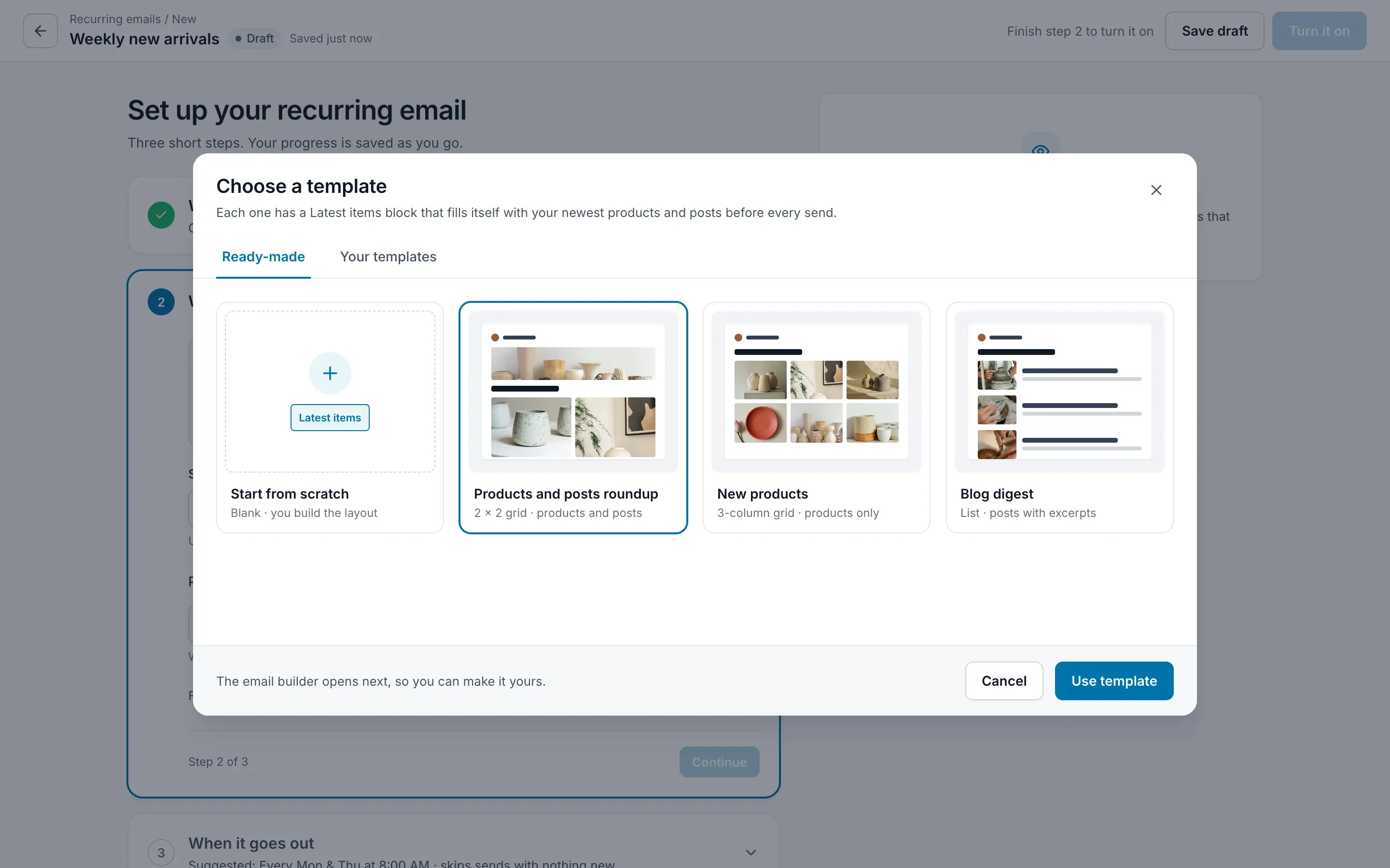
08 / 26 · Step 2 · Choose a template
Only templates that can fill themselves are offered. In the 2022 design, the email could be built without the block, with a grey note saying it would then never run.
Constraint over warning
09 / 26 · Step 2 · Choose a template
Starting from scratch is still possible. The blank email arrives with the Latest items block already in it.
Safe defaults
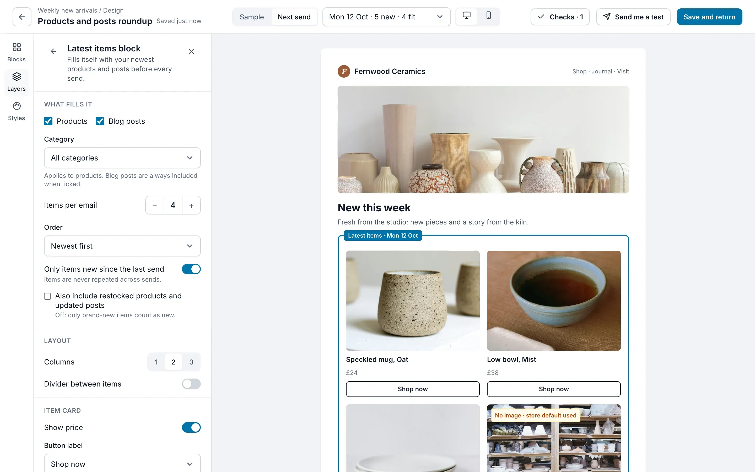
10 / 26 · Step 2 · Email builder
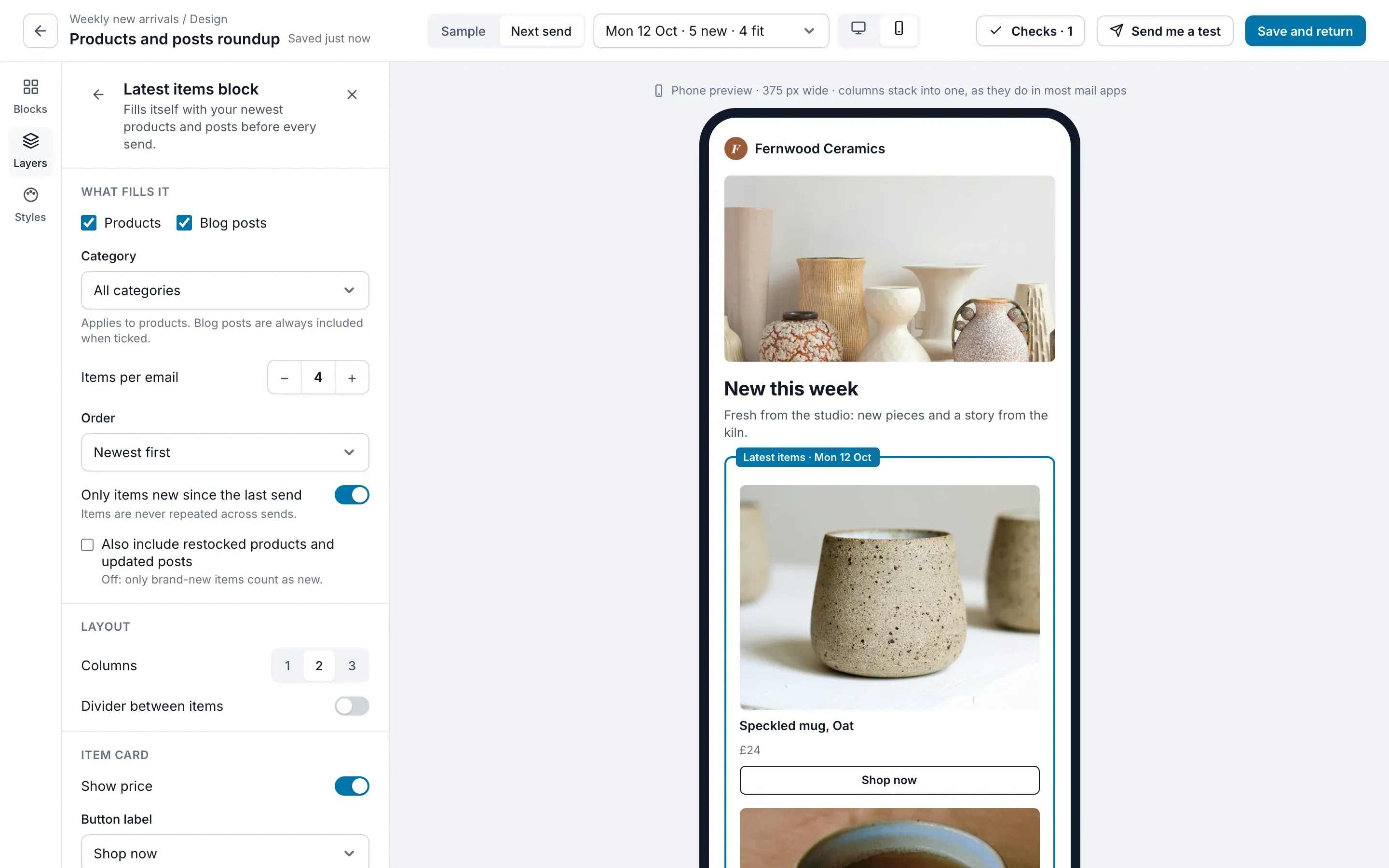
The builder shows Monday’s real email, with this week’s products, not ‘Product name’ placeholders.
“That’s exactly what my customers will see.”
What you see is what they get
11 / 26 · Step 2 · Email builder
Any upcoming send can be previewed by picking its date.
Feedforward
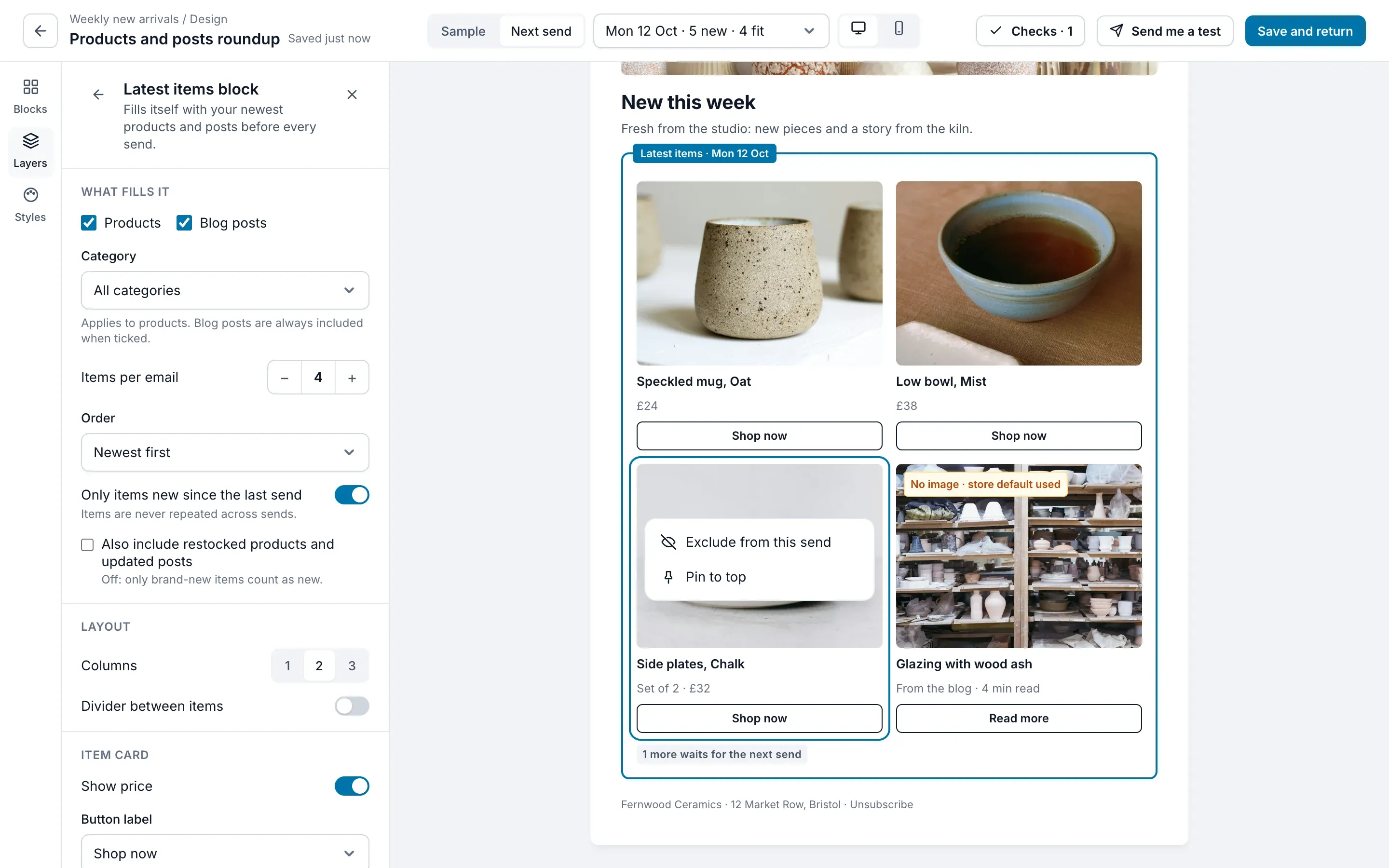
12 / 26 · Step 2 · Email builder
One item can be excluded or pinned for a single send, without touching the automation.
Sense of control
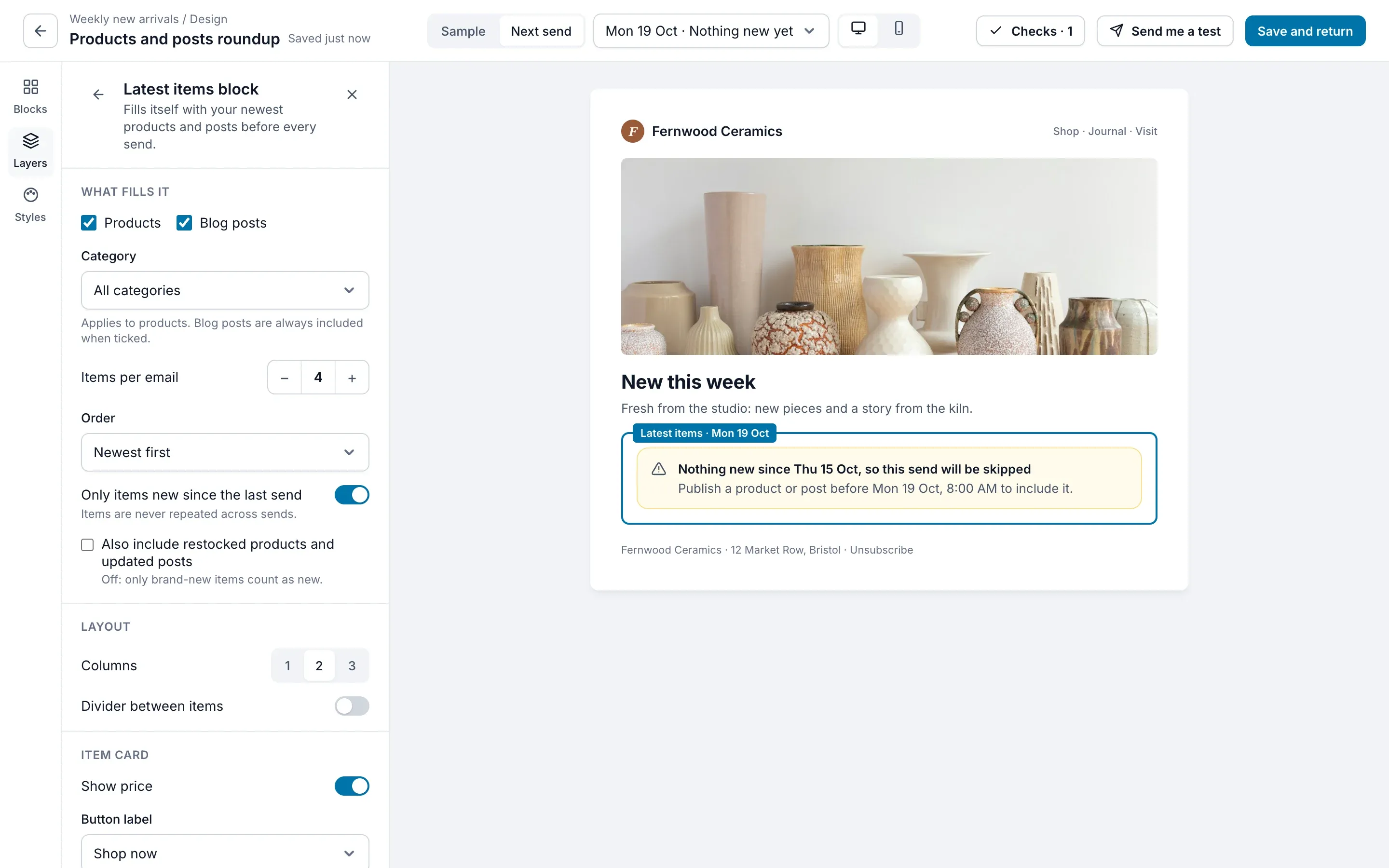
13 / 26 · Step 2 · Email builder
When a date has nothing new, the builder says so: this send will be skipped.
“Fine. Nobody gets an empty email.”
Visibility of system status
14 / 26 · Step 2 · Email builder
The phone preview is one click away, with columns stacked the way mail apps show them.
Design for the context of use
15 / 26 · Setup · Step 2 of 3
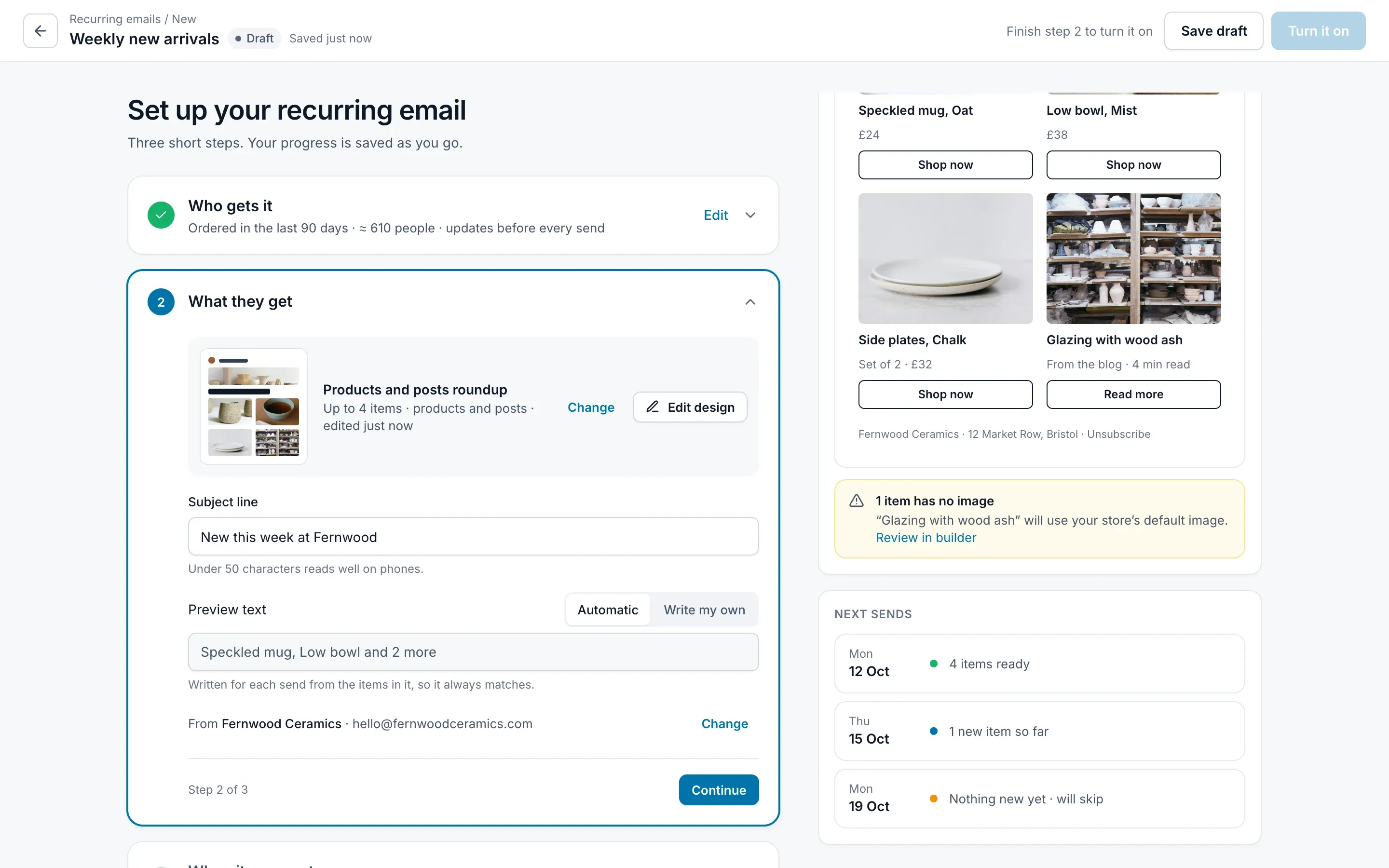
Preview text writes itself from the items in each send, so it never promises something that isn’t there.
Automate what changes every time
16 / 26 · Setup · Step 2 of 3
A missing image is caught before the email is turned on, with a link to fix it.
Error prevention
17 / 26 · Setup · Step 3 of 3
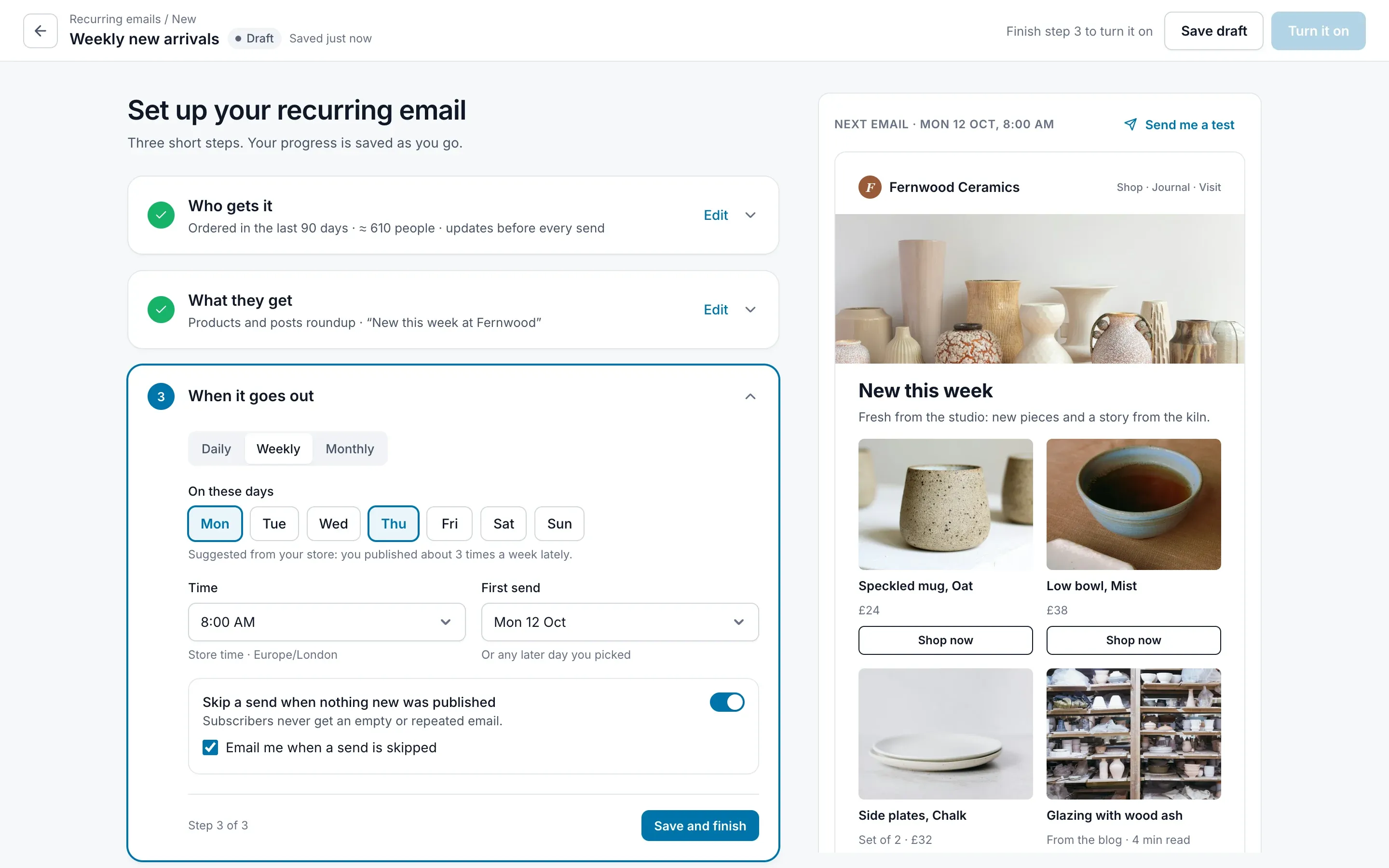
The suggested days come from how often the store actually publishes.
“I do post about three times a week.”
Default effect, backed by data
18 / 26 · Setup · Step 3 of 3
‘Skip a send when nothing new was published’ is a plain switch beside the schedule, on by default. In the 2022 design it was a condition builder.
Match the mental model
19 / 26 · Setup · Done
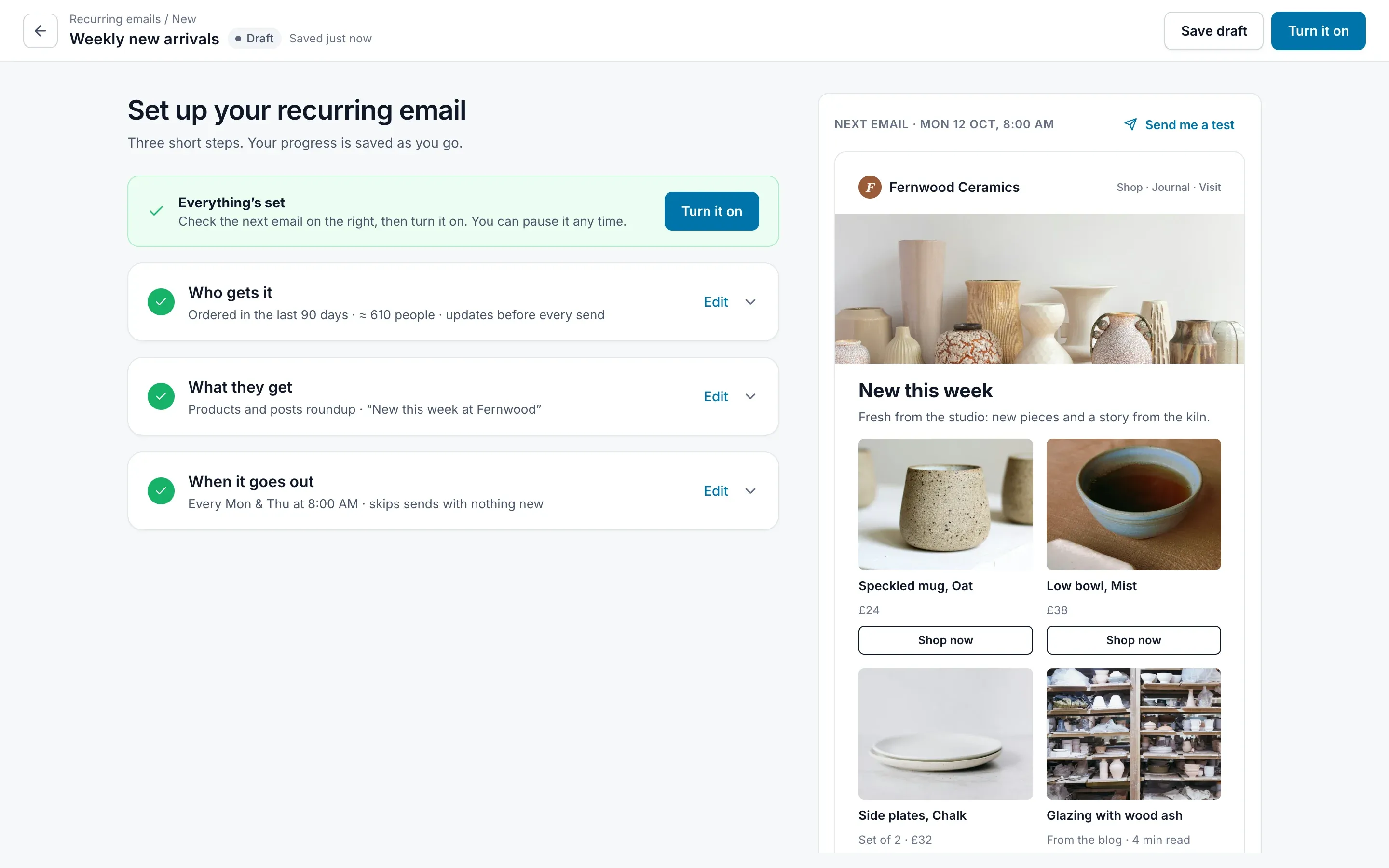
Turn it on unlocks when all three steps are done, and the page says so in words.
Completion feedback
20 / 26 · Overview · Day one
Day one shows no invented history. ‘No sends yet’.
“Phew, nothing has gone out yet.”
Honest empty states
21 / 26 · Overview · A sent email
Resending to people who didn’t open is one click from the results.
Next best action
22 / 26 · Overview · Resend
The resend dialog admits that open rates aren’t exact. Some people who read it count as ‘not opened’.
Honesty builds trust
23 / 26 · Overview · A late send
‘Sent late’, not ‘Failed’. The email went out; the label should say so.
Accurate labels
24 / 26 · Overview · A late send
It names what used up the sending limit, so the blame lands on the right cause.
Attribution
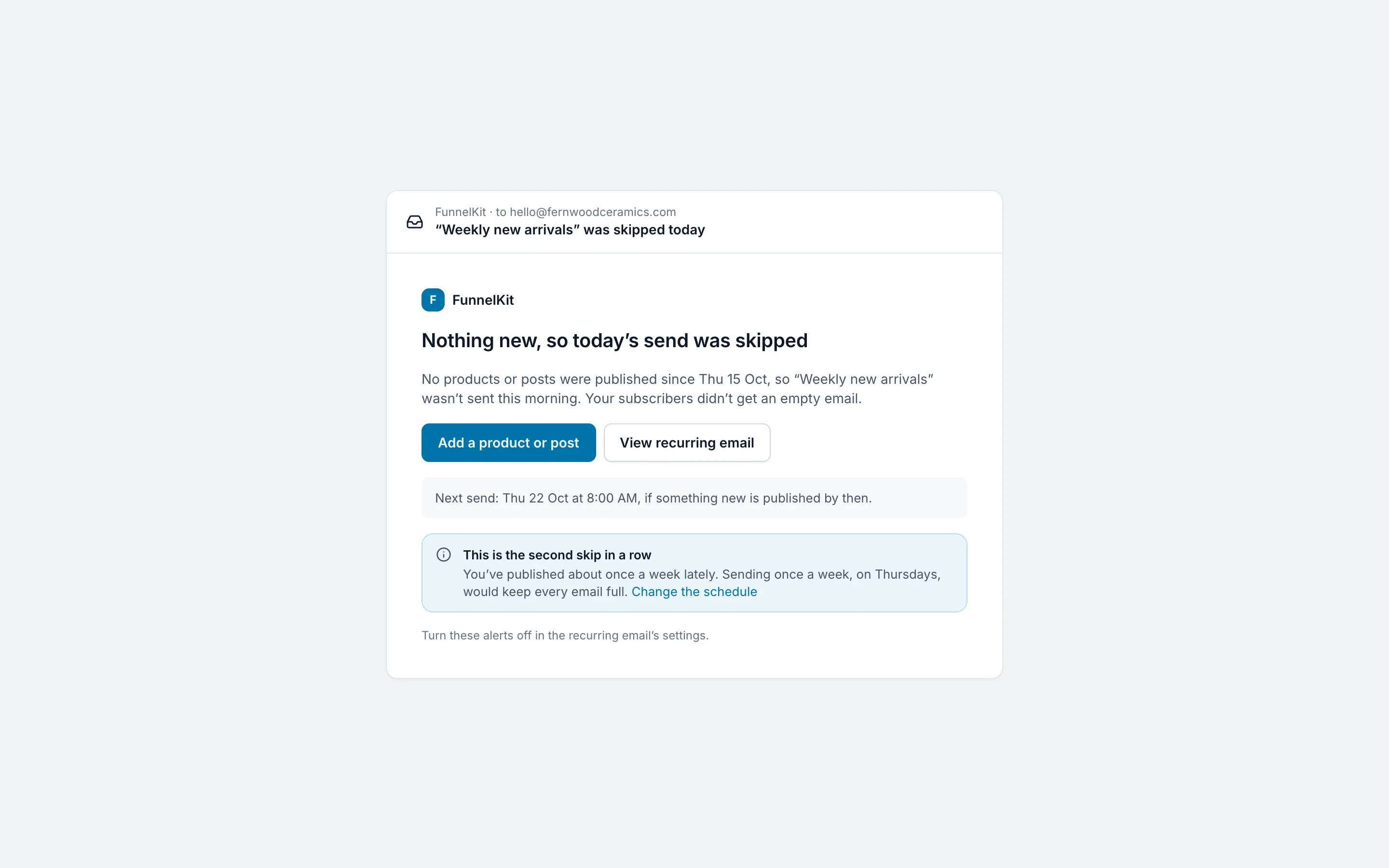
25 / 26 · The owner’s inbox
After two skips in a row, the owner gets a suggestion to send less often. Once, not every time.
Nudge, don’t nag
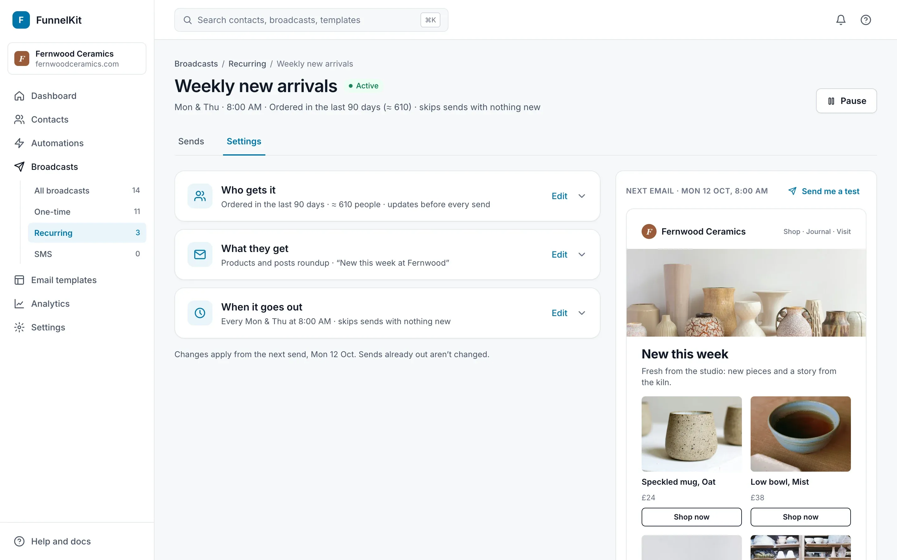
26 / 26 · Editing a live email
Changing a live email happens on its own page, in a Settings tab. No second wizard.
Edit in context
Try it yourself
The redesign, working
A working prototype with sample data from a made-up ceramics store. Click anywhere; nothing is sent.
- 01Set up a new recurring email
- 02Leave one product out of Monday’s send
- 03Find out why the 1 October email went out late
The Screens button inside jumps to any state. Open it in a new tab
The prototype is built for a laptop screen. Open it anyway
Takeaways
Four things I’d carry into any automation
01The rule that decides everything was fine print
The most important rule on the page had the least important styling.
In the 2022 design, a recurring email only ran if its template had a Post block. The design said so in a grey bar under the editor:
People don’t read warnings while they’re getting something done. They follow the path the interface leaves open.
So the redesign turns the warning into a constraint:
- Only templates that work are offeredThe template picker hides any template without the Latest items block.
- A blank email is never emptyStarting from scratch adds the block for you.
02Show the email, not the settings
Trust comes from seeing the outcome, not reading a summary of inputs.
The 2022 review step listed every setting as text.
The template could be previewed, but no screen tied a send date to the items it would carry.
Counted from the designed screens. In the redesign: the setup preview, the email builder, each send’s overview, and the test email.
The redesign shows the real next email wherever a decision is made.
03Defaults should come from the store, not from us
A blank field makes every owner do the same research.
- Suggested daysFrom how often the store actually publishes.
- All subscribers, preselectedSo new subscribers join automatically.
- Preview text that writes itselfFrom the items in each send, so it never promises something that isn’t there.
A beginner can turn on a first email in seven clicks, with no typing.
Counted in the prototype: Continue, Choose a template, Use template, Save and return, Continue, Save and finish, Turn it on.
04Label states the way the owner would say them
Status words are where trust is won or lost.
A send that went out two hours late is not a failure.
A recurring email that will run again is not complete.
| Situation | 2022 design | Redesign |
|---|---|---|
| A recurring email that will run again | In-Progress, or Completed | Active |
| Turned off by the owner | Paused, or Cancelled | Paused |
| The provider’s daily limit stops a send | Failed, with Try again | Sent late: retried automatically, cause named |
| Nothing new to send | No state designed | Skipped · nothing new, and the owner is told |
| Just turned on, nothing sent yet | No state designed | No sends yet |
What testing changed
Two simulated users, eight changes
I tested the first version with two simulated users: AI agents briefed to act as Meera and Daniel, working through set tasks and thinking aloud.
They’re no substitute for real participants. But they were quick and specific about where the design made them stop.
Right after turning it on, the overview showed past sends. “Did I already email people?”
Day one says “No sends yet”.
Restocked products were counted as new.
Restocks are an opt-in choice, off by default.
No way to pick or build a segment.
A segment picker, plus a builder with rules or hand-picked contacts.
Edit opened a second “new” setup labelled Draft.
Settings is a tab on the email’s own page.
An excluded product still showed in the previews.
Exclusions apply per send, show everywhere, and can be undone.
“Failed” on a send that went out late.
“Sent late”, with the cause named.
Fixed preview text didn’t match the items.
Preview text is written from each send’s items.
“Post block” and “Audit” meant nothing to Meera.
“Latest items block” and “Checks”.
What’s still weak
Where I’d go next
- Send pacingDaniel asked for throttling and send-time optimisation. Neither is designed yet.
- One category at a timeA store with overlapping collections can’t combine them.
- Setup still has three stepsA Phase 2 idea fills the setup from one sentence. It needs engineering planned for after the AI work.
- Real participantsThe next round should be with real store owners, on their own stores’ data.
Every problem in the first walkthrough came from one place: the design described the system’s settings, not the owner’s promise.
Reflection
Describe the promise, not the settings
The 2022 wizard wasn’t wrong step by step. Each screen did what it was asked to do.
Once the promise became the test, most decisions made themselves.
Your turn
A store publishes twelve new products on Sunday night, and the email shows four.
What should happen to the other eight: wait for Thursday, go out in a bigger email, or something else? What would you show the owner so she trusts the answer?